Reply With Quote
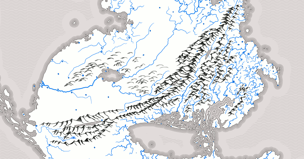
Smaller version from a (roughly) 4600x4600 original. Tarting up the coastlines to look more natural, and I must say, my technique for scraggling keeps on improving. Look at those fjords!


Well said! This is how i feel about most threads that I don't post on. I try hard to only post when I have something intelligent to add (because I can be a little loquacious if I don't watch myself).Originally Posted by Jaxilon

Oh, and Naeddyr .... I think your work on your fluid dynamics is more than sufficient. The neat thing about flatworlds is that they *depend* on divine intervention, which gives a really handy explanation for pretty much however you want it to work.
Gidde's just zis girl, you know?
My finished maps | My deviantART gallery
My tutorials: Textured forests in GIMP, Hand-Drawn Mapping for the Artistically Challenged
Smaller version from a (roughly) 4600x4600 original. Tarting up the coastlines to look more natural, and I must say, my technique for scraggling keeps on improving. Look at those fjords!
Worked on rivers today, mostly. Up until now most of this map has been mainly manual work, but the river tapering was done with the Inkscape tapering river trick. Tried to then trace *those* by hand, but it was too much damn work for too little payoff, so I mostly just cleaned them from the vector artifacts and combined them with the coastline.
Also modified those fjords. I am unsatisfied with the south for some reason, but I can't pin point why. Maybe it's the perspective.
Today I've mostly concerned myself with ornamentation: the coast line sea patterns, the ocean colour patterns, and graticules. Also cleaned up stuff.
The coastline seat pattern is a conservative, but still good-looking, Tolkienian-style parallel-lines pattern. To add variation, the outermost waves are dotted lines. Done with GIMP; I used to do this with Inkscape, but I actually think GIMP's patterns (selection to pattern and pattern to selection) are a bit less power-hungry than the ones in inkscape, and it turned out all right.
The ocean colour patterns... This took several variants to get right. I decided to not go with the pattern I created for the Ysi Special Edition Soho Go Go Let Us Fight The British In Manhattan Exhibition version, but instead tried to come up with a new one, or maybe not do one at all. In the end, after several patterns that weren't suitable (including a Japanese cloth pattern using semi-circles and a twirly one, etc.), I settled on this basic pattern I took inspiration on from the internet. I'll have to clean up the edges, which makes a tremendous difference: if you look at the middle and right-side ocean pattern borders, you'll notice a definite difference (and improvement) with the ones I've left unfudged. The layer uses a transparency mask, so it's easy to edit what parts of the pattern shouldn't show.
The graticules: there are two of them, because this is a flat world, so a square graticule is 100% appropriate: but, it's also a world with a definite center, which makes also polar coordinates 100% appropriate, so this 200% appropriate.
I'm also trying out a mountain style.
I also came up with a plan to add zodiac-style signs on the edges of map: a star map showing navigation stars, showing a particular season (probably Eastern (left) summer)).
Last edited by Naeddyr; 01-14-2011 at 03:40 PM.
Cool way to do the graticules, I'm watching this with interest while I do my flat world!
Gidde's just zis girl, you know?
My finished maps | My deviantART gallery
My tutorials: Textured forests in GIMP, Hand-Drawn Mapping for the Artistically Challenged
Mountain style. Today (and part of yesterday) I've wrestled with what mountain style to use. This is a low-tech fantasy map, so isometric mountains are quite simple to settle on, but there are several variants of them. For my last map, I went with a style that was supposed to evoke mountain chains:
This time, I decided to go with the Grand Daddy of fantastic cartography: Tolkienian style shading, using an ink-pen (equivalent). Tolkienian mountains are extremely simple to draw: start with the mountains or hills in the foreground, and use an inkpen to draw the basic outline. This already gives it a shadow, depending on the angle of the pen. Then add width to the shadows at the bases (or for an even simpler style, just do the one stroke). The mountain and shade all in one.
I like the shading. Seems a little symbol-heavy, but maybe that's just because they're the only symbols on the map so far.
Gidde's just zis girl, you know?
My finished maps | My deviantART gallery
My tutorials: Textured forests in GIMP, Hand-Drawn Mapping for the Artistically Challenged
I'm going to colorize them an appropriate color in the end, which will make them stand out less. For desert mountains, a yellow or red color would fit.
I'll post just as encouragement - I like what you're doing ! Your world-building hangs together so well I haven't seen anything I would say "why don't you try this instead" on, hence I've held my tongue. I'm with Gidde in a tendency to wax verbose.... I get all my exercise running off at the mouth and jumping at conclusions :-). Both the strings-of-ridges and the field-of-bumps mountain styles look good; your Tolkienesque choice will no doubt work well for Māinm.
As always, thanks for the comments, here's a quick update or just a quick does-this-make-me-look-fat check before I go to bed.
As I said earlier, Tolkienian style mountains. Those stand out a lot if they're completely black, though, and I'd have to go with much smaller shadows, so I've thought of coloring the mountains by climate. At least three colors: Red for the dry mountains on the rain-shadow side, towards the desert, green for the rain-side, and blue for cold and icy glacier mountains. Possibly black for generic cold mountains.
I haven't yet actually figured out how to make it go colder the higher up you are. That is not common sense, after all: everyone knows warm things go up, and the Sun is up there, what do you mean it's cold (there actually is a bit of atmosphere up there with it's own -sphere monicker that is quite warm, but mostly it gets colder)? Either I'll have to add a small atmosphere that only covers the bottom of the world (the sky dome is 4500 kilometers high: on Earth, space is defined to start at around a hundred), which follows gas and pressure laws, or I'll have to come up with something completely outlandish and fascinating. The atmosphere would do the trick, though. Maybe an ether of the spheres, that happens to be cold. Hmmm.
EDIT:
God, this whole style turned out so Tolkienian. Tolkienian coast-lines, tolkienian mountains... Even the latin script I made is so Tolkienian.
There is no other explanation to it.
Tolkien was a genius.
EDIT:
Well, the exact exact style isn't tolkienian per se, now that I googled it again. There is a fan-made map of Middle-Earth that had this style of mountain, but the usual maps don't have this kind of single-ling mountains, but proper shading. The coast-lines are totally Tolkienian, though. Well, as much as something as basic as it can be.
Last edited by Naeddyr; 01-15-2011 at 06:13 PM.
 Posting Permissions