


 Reply With Quote
Ok here is the version with the seas erased. I rather like the look of it this way, just looks cleaner and less overwhelming.


I was about to say what TM just said. Actually, since you've got it in an editor now, you could just erase a lot of the sea lines and leave them around the coasts only. The lines around the coasts already look much more deliberate than the ones in the open seas. Try it out and see if it looks good to you.
I also wanted to say that I like the cog. It has a very medieval drawing look to it.
Bryan Ray, visual effects artist
http://www.bryanray.name


Ok here is the version with the seas erased. I rather like the look of it this way, just looks cleaner and less overwhelming.

I like this version better, too. Looks nicer and cleaner. Nice job!
Here we are with a lil parchment action added.
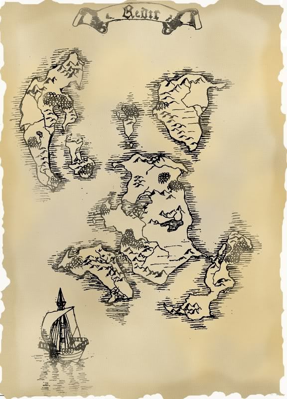
I must say, This is the hallmark of this guild! A person posts a map. A GREAT map, and then the suggestions come, the map is tweaked, and before you know it BINGO-BANGO-BONGO! The map is a work of art!
Superb!
Daniel the Neon Knight: Campaign Cartographer User
Never use a big word when a diminutive one will suffice!
Any questions on CC3? Post them with CC3 in the Subject Line!
MY 'FAMOUS' CC3 MAPS: Thunderspire; Pyramid of Shadows; King of the Trollhaunt Warrens; Demon Queen's Enclave
well thanks to all of you for the suggestions! I was pleased with the map when it started out but wow! A few great suggestions and its even better.
And thank you all for the compliments too
wow...
welcome to the guild, dude. you've got it.


Welcome to the guild and yes, this is a great map, more so since we can see the improvement you made to it.
IMHO, I'm not sure about the blur effect on the map, I think it distract my eyes.
The sea shore is great; I think I'll use it in one of my maps later on.
The scroll gives a good edge to the maps reading.
now 2 points: 1) I like the cog and maybe you could use it to make a compass rose (north with the mast); 2) It might just be me, but I think I would redo the scroll outline (dark brown or black) and add some scratch, broken part or even burn part to it. But make sure it doesn't keep the eye from the main map.
Sea U a-round,
Alu.
Let my fangs find your neck, during the night, so that I can drink your knowledge ...
So it could be use here : www.l-hazard.com
I'll ditto this is a great edit. Nice job sticking with it!!
I'll also ditto alu that the blur effect is distracting. Instead of inksmeared, it looks just oddly fuzzy, like a camera took a, spotty, out of focus pic of it. I say get rid of that.
What you could do instead is put low opacity color variations on top of all other layers, maybe dabbing with some grunge brush. Or even find some waterstain brushes or pics on the internet & put them on top for authenticity. Just some ideas.
Don
My gallery is here
__________________________________________________ _______
"Keep your mind in hell, but despair not." --Saint Silouan [1866-1938]
It is definetely fun to watch the evolution of the map. Now if only someone could make a time-lapse movie out of it, we could watch it change before our eyes.
 Posting Permissions


