Page 3 of 4 FirstFirst 1234 LastLast
Results 21 to 30 of 36

Thread: Karth

  1. #21
    Guild Expert Eilathen's Avatar
    Join Date
    Aug 2007
    Location
    Kurald Liosan
    Posts
    1,335

    Default

    I have to agree with Max. 2 or 3 are best. Not sure which of those two is better. To be honest, i'd like to see both versions
    I'm trapped in Darkness,
    Still I reach out for the Stars

  2. #22
    Guild Adept TimPaul's Avatar
    Join Date
    Oct 2013
    Location
    Manhattan
    Posts
    333

    Default

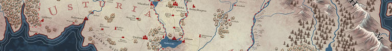
    worked on this some more this morning. I'm pretty sure I'm going to go with the trees on the right hand side. I think they give more flexablity, where I can scatter a few trees here and there, to help balance out ares. I'm also probably going to go with buildings for marker, over symbols. I darkened the oceans and seas. Not 100% sold on that.

    I also figured I'd work out the text now, so that as I move forward, everything fits together.

    Now that I look at it, I'm probably going to redraw the lines around the cost to be more natural looking. They are starting to look to stiff.

    as always, feedback is welcomed.

    Click image for larger version. 

Name:	WIP-Map-4.jpg 
Views:	155 
Size:	1.72 MB 
ID:	58910
    Last edited by TimPaul; 11-07-2013 at 12:36 PM.

  3. #23

    Default

    I agree with you about keeping the trees on the right. The good effet you have is puting some trees between the mountains, so it looks very good.
    Nice work !

  4. #24
    Community Leader Guild Sponsor - Max -'s Avatar
    Join Date
    Dec 2012
    Location
    France
    Posts
    4,220

    Default

    Yup those trees looks ok with the mountains (though I'd scale down a bit) and the coastlines definitely need some refine here.

  5. #25
    Guild Adept Facebook Connected Llannagh's Avatar
    Join Date
    Aug 2013
    Location
    Germany
    Posts
    318

    Default

    Good stuff.

    I agree, the forest on the right hand side fit the style better, though I also really like the other one. Maybe you should add a little shadow underneath the individual trees to give them a "3d"-like feel. I think that would fit even better with those mountains.

  6. #26
    Guild Adept TimPaul's Avatar
    Join Date
    Oct 2013
    Location
    Manhattan
    Posts
    333

    Default

    Quote Originally Posted by - Max - View Post
    Yup those trees looks ok with the mountains (though I'd scale down a bit) and the coastlines definitely need some refine here.
    Just "ok"? Kidding.

  7. #27
    Guild Adept TimPaul's Avatar
    Join Date
    Oct 2013
    Location
    Manhattan
    Posts
    333

    Default

    Quote Originally Posted by Llannagh View Post
    Good stuff.

    I agree, the forest on the right hand side fit the style better, though I also really like the other one. Maybe you should add a little shadow underneath the individual trees to give them a "3d"-like feel. I think that would fit even better with those mountains.
    It's not so much that I don't like the left side trees, I just don't know if they work for this map. Quite possibly be useful for another map. Few more tests.

  8. #28

    Default Re: Karth

    Thanro sound like Panama, only 100 times better!

  9. #29

    Default

    This is coming along splendidly TimPaul!

    Cheers,
    -Arsheesh

  10. #30
    Community Leader Guild Sponsor - Max -'s Avatar
    Join Date
    Dec 2012
    Location
    France
    Posts
    4,220

    Default

    Quote Originally Posted by TimPaul View Post
    Just "ok"? Kidding.
    They will be more than ok when they'll be scaled down

Page 3 of 4 FirstFirst 1234 LastLast

Tags for this Thread

Posting Permissions

  • You may not post new threads
  • You may not post replies
  • You may not post attachments
  • You may not edit your posts
  •