


 Reply With Quote

Excellent style choice. Very good and clean over all, my only complaint is the bar pattern of color becomes a bit much when you fill all of the political boundaries with it, perhaps pull it back to closer to the borders?


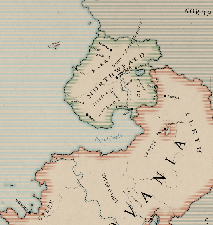
Hello people. This is my first post here and I'd like to show you the first real, full scale project I'm working on. I've done some small test maps and followed some tutorials here the last couple of weeks but now I'm working on something more sizeable. The (WIP) map represents part of a low-fantasy world (18th-19th century tech) that a group of likeminded folks are working on. Tell me what you think!
Excellent style choice. Very good and clean over all, my only complaint is the bar pattern of color becomes a bit much when you fill all of the political boundaries with it, perhaps pull it back to closer to the borders?
If I understand correctly, something among the lines (no pun intended) of this?
I'd just keep pounding the like button on that if I could. Yes that's quite lovely you'll need someone more useful than me to get any further talented criticism.
Update:
Nice job so far. I would stretch the seal labels to fit the areas they concerned. Also i'd get rid of the curved towns/settlements labels when this is unnecessary. Rather use straight labels if you have room.
I'd fade those horizontal bars more gradually, they go from opaque to transparent a bit too suddenly for my taste. Love the style though, looks like it'll be a really nice map
Great feedback guys, I'll take it in consideration when I continue working on it.

This looks really good. For me both the fully colored or the partially filled political boundaries look great. I'd suggest adding in important trade routes and fortifications given that this is a political map.
Looks very good! A similar style to something that I might do myself.
However, I feel like the font choices could be revisited. I don't know, I'm just not really feeling like any of the fonts on the map is working right now. But that might be my personal preference. Other than that, I might have the country borders not apply to lakes.
But like I said. Looks great!
 Posting Permissions


