Results 1 to 7 of 7

Thread: My first map - The Kingdom of Haven

  1. #1

    Map My first map - The Kingdom of Haven

    My quick story:

    Been working on a design doc for my imaginary RPG here and there over the years. I get burned out, move on to something else, move back in, rinse and repeat. As the pages continue to climb I decided I should map out my lands. That's when I stumbled upon this fine site. A couple of tutorials later and I was on my way. This site rocks and I'm glad I've found a group of people that share my enthusiasm for fantasy maps! I know I'm not the only one that has drawn the occasional treasure map growing up.

    Anyway, on to the map:

    Lots of learning went on here. I've never drawn or labeled a map like this before and I learned a lot of Photoshop tricks in the process. I feel like I struggle with my aesthetic sense especially when it comes to the overall balance of shapes and colors. I want to improve these skills. This map was created with a Wacom using generic fonts in Photoshop. I welcome all manner of feedback.

    Haven does not represent the world I have been working on, but rather a generic fantasy land that we can all relate to. It has a varied topography and it stands as a self-ruled and neutral continent apart from the surrounding world. Though beautiful, Haven has its share of perils that ensure adventure-seekers are never without purpose.
    Attached Thumbnails Attached Thumbnails Click image for larger version. 

Name:	finaltest2.jpg 
Views:	209 
Size:	2.76 MB 
ID:	66462  
    Last edited by Nick B; 08-11-2014 at 02:15 AM. Reason: New Map

  2. #2

    Default

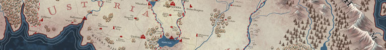
    I think it looks quite good, especially for something that involved such a learning curve. I'm particularly fond of how you did the mountains. They look dramatic, very mountain-ey, but they don't clash or obscure any elements of the map. I do have some critique:

    Since it looks like you're not trying to stick to a monochrome palette, I think you should add some hue difference between the forests and the mountain shadows. Where you have forests near mountains, they look more like another mountain range rather than forests. I'd recommend making the mountains a little more towards blue-grey, just enough to make them clearly distinct from the forests.

    Many of the labels are hard to read. The cursive typeface is partly to blame, but some of your non-cursive labels are hard to read too, because they are on too dark a background. The smaller text on forests is almost invisible, and even some of the text on the darker areas of the plains are a little hard to read (e.g. Mutant Rats). Lightening the whole map a bit would help, but if you want to keep the overall darkish look, try adding a light glow around the text, or making the text light instead of dark. I think a glow would create better contrast, but light text would allow you to create contrast without obscuring detail. See which works better for you.

    "Seabreeze Plains" is stretched out too much for its length and for its typeface. One additional reason non-cursive typefaces are preferable for maps is that they can have their letters positioned separately to create a curve without distorting the letters, since they're not connected. With cursive, distorting the letters is the only way to go. In Photoshop specifically, I'm assuming you're using the text warp tool? That's very handy for most curves, since text curvature should be kept small on maps for legibility. But for when you really need a dramatic curve, I recommend putting the text on a path instead (if you google "photoshop text on a path", you'll find many tutorials). Putting text on a path rotates each letter to fit the path without distorting it. I do not recommend using it for your gentler curves, because that little bit of distortion that warping adds helps maintain the optical cohesiveness of the text. Use it only for the more extreme curves (above 45% or so), or for text with very large spacing (where the letters are too far away for the inter-letter relationships to matter much), such as what you might use for region and country names. In any case, I think "Seabreeze Plains" specifically would've been fine with a lesser curvature, there's plenty of room there.

    Your rivers are disconnected from your lakes and the ocean by the black continent borders. Erase the borders in those parts. If you're trying to do this in a non-destructive fashion, consider adding a layer where you draw just the deltas without any layer effects, overlapping those borders. This could allow you to blend the rivers nicely into the lakes/ocean, too.
    (Matter of taste warning) I think it would look better if the rivers tapered at their headwaters. This should be trivial to do with a tablet. Even though the rivers would probably not be visible on this scale and are thick for visibility, it's not unusual for the thickness on the map to be proportional to their actual size/volume (or at least importance). Tapering would simply be an aesthetically pleasing way to show that those rivers don't start off as grand as they are as their mouths.

    A couple of more things about your rivers, they don't feel natural:
    The rivers all undulate very regularly, but the undulation is too great to look symbolic. Regular-looking waving like this happens with real rivers on large scales (up close, e.g. an aerial photo), but on smaller scales (e.g. regional scale), there's usually too much terrain variation to allow for such regular patterns. Many cartographers will add a regular waving to their rivers when they don't know the detailed paths of those rivers, but this will usually be a small undulation, not something that suggests that it's the river's actual course. If you're trying to represent the rivers' actual paths (but smoothed, I presume), I would add more variation, more curves, rather than just an undulating straight line.
    Several of your rivers split into multiple quite a ways off before draining into the ocean/lakes. Rivers tend to join, and it's very rare that they split naturally without rejoining for such long distances. It looks rather odd to me to have so many permanent bifurcations of major rivers.

  3. #3
    Guild Member Cuin's Avatar
    Join Date
    May 2014
    Location
    Madison, WI
    Posts
    99

    Default

    Very nice map. I really like the watercolor type texture and shading techniques.

    I myself really like the cursive font. I don't think the font itself is hard to read, but there are some labels that are hard to read (e.g. Lost Manor). I agree with eishiya's points about the rivers.

    Excellent map, look forward to seeing more.
    Cheers,
    Cuin

    ----------------------
    on instagram at cuin_the_cartographer

  4. #4
    Guild Adept TimPaul's Avatar
    Join Date
    Oct 2013
    Location
    Manhattan
    Posts
    333

    Default

    For a first map of this kind, there's lots of good here. For the most part, it's clear and easy to read (save for a few spots).

    Here are some suggestions if you decide to do more.

    I can see the brush strokes for your textures. When I look at it full size, it looks like you made a large texture area, and then cut the shape of the land out, and the placed that on top of the blue texture. If you can integrate the texture more, so it works with the shape of the land, your map will go up a level in terms of awesomeness.

    The mixing of the font, cursive and san serif, makes it look like the san serif font is wrong. You can mix fonts, but they should be of the same family, like Blackletter. They will be related, and you can decide which fonts are used for what. Have a hierarchy of size and fonts used.

  5. #5

    Default

    Thanks for the great feedback guys! Stuff like the rivers tip is something I wouldn't have considered myself. I made changes based on your suggestions and uploaded a new map. I think it's better because of it.
    Last edited by Nick B; 08-11-2014 at 02:20 AM.

  6. #6

    Default

    I think it's quite an improvement, especially those rivers! The added colours really help give a better idea of what the area is like.
    You might have overdone the mountain shadows a bit, I think they're too dark. The rendering on the mountains looks great aside from that, though!

    It's good that you've changed all the text to a single typeface. I may not be fond of it, but it looks much more unified now. Without the sans-serif text there for comparison, the script doesn't look as bad, even! You still have some issues of dark text on dark backgrounds. It's not so bad on the grassy/sandy areas, but the forests are very dark.
    It's a common convention to place the names of coastal locations on the water rather than on the land (while locations that are near the coast but not on it keep their names on the land). That could help you with the legibility of some of your labels, as well as disambiguate the locations, since your symbols are inexact (which is perfectly fine).

    If you're still considering amending this map instead of just using the feedback for your future projects, perhaps you should make a thread in the WIP section. That way you won't end up with a bunch of variations in the top post here, you can just have the final one (and the current two, I guess).


    Edit: I don't think the cast shadows from the location markers are a good idea. They just complicate the markers, damaging their immediate readability. Cast shadows are good for larger-scale maps where you have the actual buildings/cities visible, where it would be realistic to have the shadows and would help plant those objects on the map and wouldn't get in the way of readability. Markers aren't part of the world.
    Last edited by eishiya; 08-11-2014 at 12:10 PM.

  7. #7
    Guild Adept TimPaul's Avatar
    Join Date
    Oct 2013
    Location
    Manhattan
    Posts
    333

    Default

    The textures are better for the land, but for the water areas, they are less successful than before.

    It's good you unified the fonts, but I would suggest an all together different font, as it not very readable when you curve it, or over dark areas. And it's ok to have the fonts be different colors. In darker area's it's ok to have it be white, for readability.

Posting Permissions

  • You may not post new threads
  • You may not post replies
  • You may not post attachments
  • You may not edit your posts
  •