

 Reply With Quote
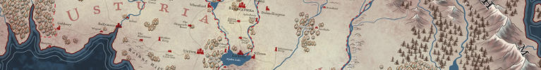
Ok, started naming all the things over the weekend. Got this far. So much more to go.


It was meant to have a shadow, just missed it. Thanks for noticing. And thanks for layers.Originally Posted by Chashio

Ok, started naming all the things over the weekend. Got this far. So much more to go.
Thoughts that came to mind looking at your newest picture: I like the font... simple, effective. The smaller labels with the white outlines are hard to read... Forest and Woods labels are especially difficult... maybe change/thicken the base color, get rid of the white outline. The Karmorth Valley label in white on top of the evergreens stands out nicely. I had to look at the lake to guess at the Kettermoor R. label. I'm not sure why you decided to slant some of the labels of localized terrain features (Reybrook Marsh, Rymoor Hills). It's easier to read the black Reybrook Marsh label than it is the Moaning Quag. Hmm... Maybe instead of outlining the forest labels, fade/scratch out the trees beneath them (and any overlapping labels: Blencathra, Moressley, Shoreham Castle). Some things to think about, anyway.
You aren't seeing it at full size and resolution. I can't post it that big, as there's a file size limitation. And nothing is 100% final yet. I stylize things, then go back and re evaluate.
Last edited by TimPaul; 07-28-2014 at 02:45 PM.
But thanks for the feedback.
Wonderful work Tim. I personally really like the subdued color palette as it allows the chosen colors to pop that much more.
I think what you're doing with the conifers and deciduous forest is great. I like the spacing with the conifers. If they were as close together as the deciduous trees then they would be too hard to see.
I do agree with Chashio about the stroke on the smaller lettering. Are you working in Photoshop? If so, what setting do you have on the font - none, sharp, crisp, strong, smooth. Sometimes changing that on smaller text makes a big difference in clarity. Also, going with a bit smaller stroke number can help. Another thing is the strong contrast between the two makes the difficulty more pronounced. An off white with a bit darker charcoal grey may read better.
One other question, do you foresee doing some slight texture on the inland bodies of water? Lakes and such? It would look good.
All that said - I love your work here. Really great stuff.
Artstation - | - Buy Me a Kofi
Thanks. Keep in mind, this is all a work in progress, and nothing is ever final at this stage.
Looking back, I agree some of the white outlines aren't working, so I went in and changed them. I formalized the size of text and made everything bolder, so it read easier.
In some area's I'll be softening the details behind the text, but that comes later, once I have made choices. There's no sense in doing a lot of extra work that I'm going to have to change or remove later.
I have experimented with texture on the small inland lakes and decided against it. It ended up looking to much like a hole in the land. Maybe some slight texture would prevent that, but for now, I think i'm fine with how they are.
More work, and some background on my large fantasy world map.
Click on the link to see and read more.


Looking awesome, dude. You've got a typo in 'Valley of the Wyvern'.
 Posting Permissions

