

 Reply With Quote
Well, for what it's worth, I think this is a gorgeous map!!


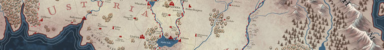
Im posting this, because I have a feeling that this version won't see the light of day, as the client is now thinking they don't want a paper background, but just white, which I think looks terrible.
It's for a companies website for advertising a line of products.

Well, for what it's worth, I think this is a gorgeous map!!
Yes, I second Chick. I can't speak for the b/w one, but this one is just excellent.
Well, here's the white background version. I just think it's not interesting to look at.
Last edited by TimPaul; 08-05-2015 at 10:09 AM.
You know what, Tim, that is still a very excellent map! It's just not as striking as the colored one, but you should still be plenty proud of it. I'd rep you if I could
Thanks so much. it's totally one of those things where if I saw the white background map, I'd probably really like it, because I wouldn't know the options.
But knowing what I have done, vs what the client might want, yeah, I'm like, go for the more visually appealing map.
I agree, the b/w is also nice. The first one is better, mainly because it "fills" the blanks in some inland parts better imho (in North America & Russia mainly).


I like the b&W could you maybe make the grid lines 50% black or play a little with shades of gray. But I think it's nice in it's simplicity. The color one is nice as well.
That's a shame, because without the paper texture you'd lose the texture accents that make the continents pop out. But the white version doesn't look terrible IMO.

Echoing the sentiment that the linework is gorgeous on its own, but the paper texture makes everything that much better. Lovely map!
Moonflowers is about an Irish guy, an American girl who ends up living with him, and the dog they rescue. Who is secretly the girl's presumed-dead father.
...Yeah, it's that kind of story.
And by story, I mean "fairy-tale."
And by fairy-tale, I mean "the unsettling kind."
 Posting Permissions
