As I said on other posts, I'm not the guy of the shields, but you did a really good work. The only thing I think it's not ok is the background, it doesn't seems to fit with the shields.
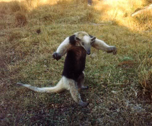
Haha yes, now i can see the ray (and it makes much more sense...) Sorry, i kinda "read" the shield upside down. It seems the anteater just sprung of my feverish imagination.
... would be a cool totem animal nonetheless...
Cheers,
AL

As I said on other posts, I'm not the guy of the shields, but you did a really good work. The only thing I think it's not ok is the background, it doesn't seems to fit with the shields.
That anteater looks like it's wearing a waistcoat! Sorry, that's completely unrelated to GWN's artwork, but I can't unsee it now.
"We are the music makers, and we are the dreamers of dreams"
My business website: https://www.greatwhitenorthcartography.com/
My full cartographic portfolio: http://cargocollective.com/BodennerC...phic-Portfolio
My Patreon account: https://www.patreon.com/user?alert=2
Nice new shields, the one with the ship is real good.
My Battlemaps Gallery http://www.cartographersguild.com/al...p?albumid=3407


I really like the uniqueness of each shield in outside shape, color selection, and content. The boat one on the bottom is my favorite. I would suggest a different background; either no background at all, or something a bit more neutral, or maybe put them on top of a small piece of a map you've already made. The ripples and color are a bit distracting.
The new shields are fantastic GWN. Great motives and lovely colors!
Loved the shields, especially that Lotus Dragon one, but I still don't think this is a good background. As Coriolis said, what about something more neutral? Maybe just more light, I think this bg is too dark. More contrast will make the drawing better (I think).