Reply With Quote
I'll try that and see how it turns out.

I would keep the lake like the river, concentric lines rather than horizontal lines.
-Rob A>
I'll try that and see how it turns out.
Looking great!
Don
My gallery is here
__________________________________________________ _______
"Keep your mind in hell, but despair not." --Saint Silouan [1866-1938]
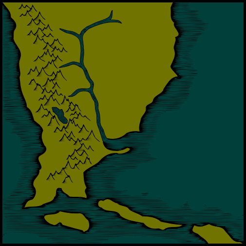
Changed how the lake looks and added shading to the mountains. I'm still not sold on the river, but I think I just need to do the lines a few times until I get one that I like.
I like the mountain shading very much! It really ties in with the sea style, giving the entire map an etched and colourized look!
-Rob A>
Hey, Helium: Looking great! Very, very impressive. Keep 'em coming!
Did you achieve the shading for the moutnains with the same method as you used for the coasts?
Also, how did you get the lake & river ripples?
Don
My gallery is here
__________________________________________________ _______
"Keep your mind in hell, but despair not." --Saint Silouan [1866-1938]
I love seeing new ideas being developed, and this is one. Like RobA, I think the mountain shading adds a really nice consistency to the woodcut feel of the map.
Another thing that just jumped out at me is the way the river is drawn (wide). While not "realistic" (respecting measured distances) it is very similar to many sea/ocean charts I have seen by explorers hitting a new coast. All of the waterway features are magnified to show useful details (for navigating) while the inland features are distorted to fit.
-Rob A>
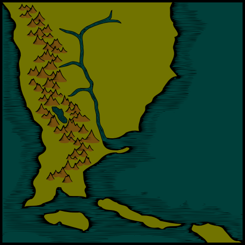
I added in color for the mountains. I'm not 100% sold on this addition, as I wish I had a better way to handle the border between the mountain color and the basic land color. I've thought of a couple of ways I could work with this, but none of them really work for me any better at the moment.
I used a similar method, yes. I drew the basic outline of the mountains using bezier lines in inkscape, then exported them as .png files. In gimp, I added the shading in the form of a pattern fill and then imported the .png back into inkscape. Then, I traced the .png and simplified it to get what you see on the map.Originally Posted by pyrandon

The lake and river used the same method.
 Posting Permissions