


This is one of my most recent old school blue maps done entirely in GIMP. I owe it all to the fantastic tutorial by torstan!


This is one of my most recent old school blue maps done entirely in GIMP. I owe it all to the fantastic tutorial by torstan!
I love the non symetrical ground level. And there is something about old school blue that is still very appealing. Nice work.
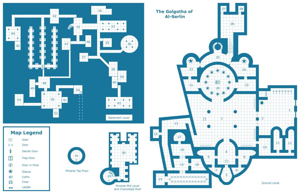
Thanks! I am very proud of this one. I was cruising the Googles one day and stumbled across the blueprints for the Church of the Holy Sepulcher in Jerusalem and thought, gee, that would make a really cool old school map! I changed a few things but it is a pretty close approximation.
Looks Great! Was there a reason why old school maps were printed in blue?
I remember reading somewhere at wizards that hey were printed in blue to prevent (illegal?)photocopying as blue made a mess.I similar thing had happened with the orange character sheets which were also made for the same reason.
Yeah, what Avengeil said. That was the pre digital age, I guess. Commercially available scanners had not pyet enetrated the household market.
Yeah that's true about blue. As a story editor in the dark ages I think we used a blue pencil for anything that was not to show up on a photocopy. Maybe it was another colour: who can remember?
Hi ho, hi ho, it's off to work I go..
Yep. Non-repro blue. We used to use blue pencil for editing as well - because it doesn't show up at all on photocopies. Red on black also works well as a photocopy preventer...a lot of Commodore 64 copy protection sheets used that. It was hard to see with regular eyes, let alone photocopiers.
Great map!
M
Ah I didn't know that about the blue. Sorry for the threadjack, Druvas!
Thanks Mearrin69!
No worries ravells!
 Posting Permissions

 Reply With Quote


