

 Reply With Quote


I don't see the conifers as popping indeed. it's fine for me. Nice stuff so far.


Why did I want the conifers to pop? I really wanted a strong difference between the the two trees styles. Not everyone sees the conifers as popping. I spent a lot of time trying many different options for trees. I finally decided on this approach, but it's by no means the final choice. I need to get everything in place first, and then evaluate the over all effect. Some forest area's are going to be big.
The benefits of working digital.
Adding green. Something else I worked with, and I just didn't like it.
This map is for myself and the game world I DM in.
I don't see the conifers as popping indeed. it's fine for me. Nice stuff so far.
Let me elaborate a bit (i don't know if chasio also talks about this but at least i am not alone in the impression that it...detracts) : It is not only that the color of the conifers is much stronger than those of the other trees (i think i would have given the broadleafs a more green color than what they yet have) but it is also the density of the forests...the placement of the trees. Your broadleaf forests are much denser (more trees per square-inch or whatever measurement one has on a map like this) than the conifer forests...the conifer forests are indeed pretty sparse...which also adds to the pronounced difference of perception.
Btw, no need to sound defensive, Tim. It's your map. So you're the one who decides what is best. But this is a forum and you asked for opinions...so here you got some. And it is just pure probabilities that you'll not like all of them
And just to reiterate...the overall map is really cool. Or at least I do like it
And i'll ask again - would you tell us a bit about the world itself? I'm a passionate roleplayer as well...and am always interested in the game worlds of other players and GMs
I'm trapped in Darkness,
Still I reach out for the Stars
Thanks.Originally Posted by Eilathen

If I sound defensive, I'm really not. I'm just confident in my choices. They come after a lot of of experimenting. Because you are right, it's my map.
Sometimes people post feedback without realizing it comes across as, "This map would be better if you did it this way." While they may not intend to do that, it is how it comes across. It's a fine line to walk, giving feedback that doesn't end up really being personal preference. We all have them.
I have goals for this map, which I haven't explained, and might not, as it's still in development. One of them is a very limited color palette. The green just doesn't fit in with my vision. Every way I tried to add some, it just moved it farther from where I wanted this to go.
For example. You think the conifers pop, other don't. For me, that can't be a consideration, because everyone is going to see things differently. Again, it's really more personal preference at that point. I appreciate it though, because even when feedback is someone's opinion, there's always a chance they are right, or open your view to a different view.
As for the history of this setting. There's a lot, and I just don't have time to put it all here. It's a fantasy world. I use it in conjunction with the Dungeons and Dragons rules. The land has under gone a dramatic reshaping in the ancient past, which resulted in the seas between the two large land masses. But it was so far in the past, it doesn't have much impact on the current time.
The major conflicts in the world tend to come from other planes, trying to control or destroy the world, as it's the barrier that keeps the Astral Planes and the Elemental Chaos apart. Before the creation of the world, the two planes were connected.
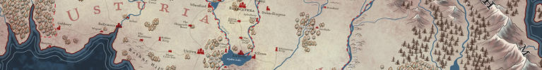
Here is an update. Filling in the Tundra and northern lands.
Screenshot (15).png
Print size is 50 x 37.5 inches, 300 DPI.
The reddish trees are more for texture when there are a lot of trees together. They are actually more brownish when printed and viewed at actual size. There's three tree indicators. Broadlead which I don't think you can see any on this map, and conifer, and dead forest areas. There are some blighted area's in the world.
I got all the geographical features in place. I'm mostly satisified with this for the base.
I plan to do all the symbols and text with InDesign. One of my goals is to have a layered PDF that you can turn the names and locations on and off. So you can see different things. Like laylines, shipping routes, over land routes, and more.
Karth_Art.jpg
That's beautiful, Tim. One small suggestion, though... If I'm reading it correctly. The cliff that spans the southern continent to the south of the lake is difficult to interpret, at this size anyway, and it could perhaps use a slight shadow. Something to keep in mind at any rate.
 Posting Permissions

