Page 1 of 3 123 LastLast
Results 1 to 10 of 21

Thread: Sorantis (personal project)

  1. #1

    Default Sorantis (personal project)

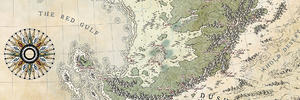
    I don't have much to say about the map.
    I started it as a practice and it grew... as usuall

    My intention was to make a top down map this time and i made this.

    With the lines finished, i decided to colour the map with some low saturated colours, and got that.

    Unfortunately the more i played with it, the less i liked it :/ in the end i could not figure out the nice style with low saturated colours and went with my usuall technique.

    The map isn't bad, but overall i am disappointed, since i was going for something quite different.

    Click image for larger version. 

Name:	Sorantis_finished.jpg 
Views:	1320 
Size:	4.59 MB 
ID:	103355
    New Horizons
    Fantasy maps and illustrations.


    All my non-commisioned maps are FREE for personal use. Get them at my home page New Horizons
    Get more of my maps by becoming my Patreon.

    Support:
    Patreon | Tip via PayPal.Me | Buy Me a Coffee

  2. #2
    Guild Expert Wingshaw's Avatar
    Join Date
    Aug 2012
    Location
    Usually Denmark
    Posts
    1,531

    Default

    I like it. Sure, there are some bits that don't work quite as well, but overall I think it is really good. The forest and coastal waves jumped out at me straight away as the best features, but as I looked at it more I saw other things that I like a lot: the dunes, the way the desert blends into the grasslands, the compass and sea texture in particular.

    You didn't ask for critique, but I'd like to offer my thoughts. Accept or ignore them as you see fit.

    I think the main things that don't work so much - in my opinion - are:
    - the coastlines on the landward side (as I said, the waves are great): they look like they should be more rugged and change colour a bit - perhaps some grey or black rocks and cliffs
    - the white canvas around the border
    - the mountains: I don't know why but there's something that doesn't look quite right about those mountains. Perhaps it is that the green is too strong in the mountainous area. I'd suggest maybe some more grey or brown in the valleys and slopes. The other possibility is that the ridge lines of the mountain ranges don't stand out enough. Some deeper shadows and stronger highlights might help with that.

    Overall, though, I like it a lot. Have some rep

    Wingshaw


    Formerly TheHoarseWhisperer

  3. #3
    Guild Master Facebook Connected - JO -'s Avatar
    Join Date
    May 2016
    Location
    Geneva, Switzerland
    Posts
    2,824

    Default

    It's nice to see a map different from what we are used to coming from you... but it's hard to understand your disappointment. I find it very beautiful...

    Is it because you also wanted to change your palette of colors ?

  4. #4

    Default

    Don't get discouraged Voolf
    It's a good attempt at variation in style and design, which is always worthwhile.
    Developing new styles and techniques takes time, trial and error.
    It's just part of the process.
    There are lots of things in the map that I think work very well.
    Keep pushing through and trying new stuff. It's always the right move.

  5. #5
    Administrator waldronate's Avatar
    Join Date
    Mar 2007
    Location
    The High Desert
    Posts
    3,561

    Default

    It's a very pretty map, especially at lower detail. I think the major flaw with it is that there is too much detail on the full version (especially on the mountains). The lower third of the map by itself is spectacular (as is the left third). The middle field of mostly-mountains has too much curly detail for my visual system to process at once, which makes it appear to "crawl" as my eye wobbles around to try to look at individual pieces of the mountains. The monochrome version doesn't have as much detail and my eye doesn't have the same problems with it (and the cropped version with the brown mountains doesn't bother me, either) . I suspect that it's a contrast issue which stems from lack of white space.

  6. #6
    Community Leader Kellerica's Avatar
    Join Date
    Nov 2014
    Location
    South Scotland (originally Finland)
    Posts
    2,807

    Default

    Quote Originally Posted by waldronate View Post
    It's a very pretty map, especially at lower detail. I think the major flaw with it is that there is too much detail on the full version (especially on the mountains). The lower third of the map by itself is spectacular (as is the left third). The middle field of mostly-mountains has too much curly detail for my visual system to process at once, which makes it appear to "crawl" as my eye wobbles around to try to look at individual pieces of the mountains. The monochrome version doesn't have as much detail and my eye doesn't have the same problems with it (and the cropped version with the brown mountains doesn't bother me, either) . I suspect that it's a contrast issue which stems from lack of white space.
    W said it pretty well, I agree with pretty much every point he made. There's an overall feeling of restlessness that I assume probably wasn't what you were going for. I still think there is a lot of value to this piece, even if it wasn't what you had in mind. Especially the more subtle elevation point around Panthra looks fantastic. To me, it seems like perhaps less would be more in this style... Maybe try a little more straighter lines next time with the mountains and such? Can't say for certain, but that's my first instinct here. The landshape is also great. And man alive, I love that compass rose design to pieces!

    Keep at it! With your mad skill for penmanship in general, I look forward to seeing more experiments with this more top-down style of map! I'm sure you'll be nailing that and leaving me gnawing at my keyboard in envy once more in no time

    Edit: Can't seem to be able to rep you right now, but the map is deemed well-worthy of it nonetheless!
    Last edited by Kellerica; 01-14-2018 at 12:37 PM.
    Homepage | Instagram | Facebook | Artstation
    Just give me liquorice and nobody gets hurt.

  7. #7

    Default

    Definitely don't feel disappointed, Voolf!

    It is a very pretty map.

    I only have two suggestions, one of which has already been made. I agree that there do seem to be a lot of lines around the mountains, maybe rely a bit more on shading?

    The other thing is that you could try making the colours of the land just a tiny bit more vibrant. they seem a bit grey to me.

    But those are two relatively inconsequential details. The map as a whole is gorgeous - and its only an experiment!

  8. #8

    Default

    Quote Originally Posted by Wingshaw View Post
    I like it. Sure, there are some bits that don't work quite as well, but overall I think it is really good. The forest and coastal waves jumped out at me straight away as the best features, but as I looked at it more I saw other things that I like a lot: the dunes, the way the desert blends into the grasslands, the compass and sea texture in particular.

    You didn't ask for critique, but I'd like to offer my thoughts. Accept or ignore them as you see fit.

    I think the main things that don't work so much - in my opinion - are:
    - the coastlines on the landward side (as I said, the waves are great): they look like they should be more rugged and change colour a bit - perhaps some grey or black rocks and cliffs
    - the white canvas around the border
    - the mountains: I don't know why but there's something that doesn't look quite right about those mountains. Perhaps it is that the green is too strong in the mountainous area. I'd suggest maybe some more grey or brown in the valleys and slopes. The other possibility is that the ridge lines of the mountain ranges don't stand out enough. Some deeper shadows and stronger highlights might help with that.

    Overall, though, I like it a lot. Have some rep

    Wingshaw
    Thank you. I am always glad to hear any comments, suggestions and critique. The mountains were a big problem, i was trying to do something different, but redoing them 3 times tired me. I know they don't look good but i just did not feel like making them anew again. They are too small comparing to the rest of the map. Scale problem :/

    Quote Originally Posted by - JO - View Post
    It's nice to see a map different from what we are used to coming from you... but it's hard to understand your disappointment. I find it very beautiful...

    Is it because you also wanted to change your palette of colors ?
    Thank you JO. As i said the map is not bad, but i did not handle mountains the way i wanted. That is first thing. The second is indeed the colours. I wanted this map to be very low saturated light colours. It is just the opposite

    Quote Originally Posted by J.Edward View Post
    Don't get discouraged Voolf
    It's a good attempt at variation in style and design, which is always worthwhile.
    Developing new styles and techniques takes time, trial and error.
    It's just part of the process.
    There are lots of things in the map that I think work very well.
    Keep pushing through and trying new stuff. It's always the right move.
    Thank you J.E. I will definately try again...and again...

    Quote Originally Posted by waldronate View Post
    It's a very pretty map, especially at lower detail. I think the major flaw with it is that there is too much detail on the full version (especially on the mountains). The lower third of the map by itself is spectacular (as is the left third). The middle field of mostly-mountains has too much curly detail for my visual system to process at once, which makes it appear to "crawl" as my eye wobbles around to try to look at individual pieces of the mountains. The monochrome version doesn't have as much detail and my eye doesn't have the same problems with it (and the cropped version with the brown mountains doesn't bother me, either) . I suspect that it's a contrast issue which stems from lack of white space.
    I agree with you. I see the same problem. I overdid the mountains and there is too much clutter. Thank you for comment !

    Quote Originally Posted by Kelleri View Post
    W said it pretty well, I agree with pretty much every point he made. There's an overall feeling of restlessness that I assume probably wasn't what you were going for. I still think there is a lot of value to this piece, even if it wasn't what you had in mind. Especially the more subtle elevation point around Panthra looks fantastic. To me, it seems like perhaps less would be more in this style... Maybe try a little more straighter lines next time with the mountains and such? Can't say for certain, but that's my first instinct here. The landshape is also great. And man alive, I love that compass rose design to pieces!

    Keep at it! With your mad skill for penmanship in general, I look forward to seeing more experiments with this more top-down style of map! I'm sure you'll be nailing that and leaving me gnawing at my keyboard in envy once more in no time

    Edit: Can't seem to be able to rep you right now, but the map is deemed well-worthy of it nonetheless!
    Haha, thank you

    Quote Originally Posted by Mouse View Post
    Definitely don't feel disappointed, Voolf!

    It is a very pretty map.

    I only have two suggestions, one of which has already been made. I agree that there do seem to be a lot of lines around the mountains, maybe rely a bit more on shading?

    The other thing is that you could try making the colours of the land just a tiny bit more vibrant. they seem a bit grey to me.

    But those are two relatively inconsequential details. The map as a whole is gorgeous - and its only an experiment!
    Thanks Mouse.
    There are not many lines for mountains as i erased most. It's the shadow that i did wrong :/ As for the colours i did not want them to be vibrant. Unfortunately some of them are some not. That is why overall the end result is somehow strange looking.
    Last edited by Voolf; 01-15-2018 at 04:09 AM.
    New Horizons
    Fantasy maps and illustrations.


    All my non-commisioned maps are FREE for personal use. Get them at my home page New Horizons
    Get more of my maps by becoming my Patreon.

    Support:
    Patreon | Tip via PayPal.Me | Buy Me a Coffee

  9. #9

    Default

    It's an excellent map! and it's good to get out of our comfort zone sometimes

  10. #10
    Professional Artist ThomasR's Avatar
    Join Date
    Nov 2015
    Location
    Angers, France
    Posts
    4,153

    Default

    The map IS amazing but it worked better in black and white to my eye.

    If I may give a piece of advice about colors. I recently started working with filled layers for the colors of my map, working on a black mask to make the color appear where I want it and with the flow I want. When I'm not satisfied by the color, I just have to change it by double clicking on the layer and the blending modes get me where I want to go. It's way less frustrating and way more efficient. My two cents.

Page 1 of 3 123 LastLast

Posting Permissions

  • You may not post new threads
  • You may not post replies
  • You may not post attachments
  • You may not edit your posts
  •