Hehe, there is something very charming on this map. I have absolutely no culture in contemporary music so I feel frustrated to not be able to enjoy the names, but I can at least say I'm in love with your compass ^^

He was overmedicated during the time frame the show was on, but his singing was a lot clearer than his speaking despite the meds.
That guy must have been very confused with the music changing from Buffet to Sabath! Very different.
It's like Hendrix's first big concert gig was opening for The Monkees, that didn't work out very well.
Last edited by Bogie; 05-01-2018 at 11:24 AM.
My Battlemaps Gallery http://www.cartographersguild.com/al...p?albumid=3407
Hehe, there is something very charming on this map. I have absolutely no culture in contemporary music so I feel frustrated to not be able to enjoy the names, but I can at least say I'm in love with your compass ^^
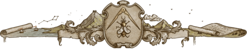
Thanks, MistyBeee! I had fun playing around with different dragonfly/mountain/compass styles and liked this one best. I am not really a music aficionado at this point in my life, but I was super into "hair metal" (or glam metal) in high school so I took a trip down memory lane.Originally Posted by MistyBeee

### Latest WIP ###

Oh man, I am probably going to have to vote for this map. You put Badlands in there. One of my all time favorite vocalists (Ray Gillien) and one of my top 5 favorite guitarists (Jake E Lee), both of whom I was fortunate enough to meet back in the day.
GW
One's worth is not measured by stature, alone. By heart and honor is One's true value weighed.
Current Non-challenge WIP : Beyond Sosnasib
Current Lite Challenge WIP : None
Current Main Challenge WIP : None
Completed Maps : Various Challenges


A very good looking map and book cover. I like the concept.
It's interesting to see the names from an era where my music exposure was limited to the clock radio waking me up in the morning.
But one name does stand out - Steppenwolf rose to popularity during my senior year in college and I had a couple of their albums (on vinyl of course).
A suggestion: the book has black along the edges, most noticeably along the spine. Perhaps a more zealous crop.
Or even better, convert the black to a muted red so it looks like red threads from the frayed cover (which it probably was originally).
Adding some (partial) transparency at the edges (a pixel or two) could also help the transition.
(I know how to do it in GIMP, but Photoshop has so freaking many layer types and options...)
Awesome that you got to meet them! I love me some Badlands.
The black is partially my drop shadow being weird. I'm honestly not sure what's going on with that, since this is the first time it's given me problems. But you're right, there's some black on the edge of the book, which is bizarre (and doesn't show up if I remove the drop shadow). The book cover is a photo that I took in good light on an off-white background so I have no idea where the black came from! I thought I solved the issue last night, but looking at the latest version now, I can see I did not. Thanks for the tips, I will play around with that more.
I was a bit torn on which band names to use - I'm a big fan of actual classic rock (as well as what now gets tagged "classic rock," but I just can't think of Bon Jovi and Motley Crue as classic rock) and most music from the '80s - but the Lost Island of Queensryche popped into my head and sounded pretty boss. It took me back to my days of buying Metal Edge Magazine at the grocery store.The first music I bought as a kid was vinyl, too - Duran Duran's Rio, Michael Jackson's Thriller, and David Lee Roth's EP, Crazy from the Heat.
### Latest WIP ###

Great presentation, and a lovely map
I seem to have missed the 80s where music is concerned. Probably too 'into' my education for my own good, but I still recognise some of the names
Free parchments | Free seamless textures | Battle tiles / floor patterns | Room 1024 - textures for CC3 | GUILD CITY INDEX
No one is ever a failure until they give up trying
Thank you, Mouse, I'm glad you like it!
I figured out the source of (most of?) the black edges - the drop shadow was picking up the teeniest little threads that are sticking out of the book. They didn't become noticeable until I zoomed waaaaay in. I still have to futz with the edges of the book to clean them up a bit more and finish wrangling the drop shadow into submission.
### Latest WIP ###

That frayed and slightly skewed back cover had a certain charm,
but this is looking a whole lot better.
Looks great.
My Battlemaps Gallery http://www.cartographersguild.com/al...p?albumid=3407
 Posting Permissions