


Looks fantastic!

I've now finished the inking in.
### Latest WIP ###

View my map and asset packs on CartographyAssets or DrivethruRPG. Support my work on Patreon. Take a look at my work on my Website or Instagram.
Looks fantastic!
My Battlemaps Gallery http://www.cartographersguild.com/al...p?albumid=3407
'loving the idea and the realisation !
Very nice! I love how every challenge submission this month is hand drawn so far, and over half of them in traditional media. If coloured pencils is next month's theme, I think I know who'd take home the silver compass.
---------------------------------------------------------------------------------------------------------------------------------------------------------
---------------------------------------------------------------------------------------------------------------------------------------------------------
Thanks BogieOriginally Posted by Bogie

Thanks MistyBeee, I did take some inspiration from your "Realm of Champie" piece for this one as well.
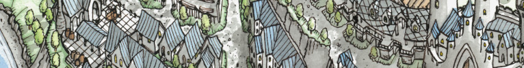
Thanks Kisachik, speaking of coloured pencils, here is the final (probably) coloured image. I tried applying a noise reduction filter to the final image to smooth our the colouring a bit and make the pencil marks less visible and I'm quite pleased with the way it turned out.
### Winner ###

Last edited by ChickPea; 04-27-2021 at 03:26 PM. Reason: Added Winner tag
View my map and asset packs on CartographyAssets or DrivethruRPG. Support my work on Patreon. Take a look at my work on my Website or Instagram.
Beautiful.... I really like how it came out. Chapeau!
Pencil marks can have their charm. I just dug out my coloured pencils that I haven't used in years and drew a picture with them two of days ago. I'm absolutely in love with the result, and the only part I would change about it would be to not use a pen for my frame outline. The pencils really are beautiful.
Have you tried watercolour pencils or crayons? Creating watercolour washes can give you a smoother look on heavily textured paper.
---------------------------------------------------------------------------------------------------------------------------------------------------------
---------------------------------------------------------------------------------------------------------------------------------------------------------
Hi Kisachik, I think I slightly misspoke when I was explaining the filtering. The main reason I use the filter is to get the scan of the piece to look more like the original. When I scan the page in, the scanner washes out the image a bit and I also get white flecks from small recesses where the pencil doesn't penetrate that you can't see on the original. I alter the saturation and shadowing to correct the washing out and the noise reduction filter blends the white flecks back into the image and makes the scanned image look more like what I see on the page. I have also tried photographing the image to digitize it but to date I haven't been able to get results as good as I do with scanning.
View my map and asset packs on CartographyAssets or DrivethruRPG. Support my work on Patreon. Take a look at my work on my Website or Instagram.
Your work gets better and better. Great to see traditionally drawn and coloured maps like this, beautiful piece.
This looks absolutely amazing! I have to agree with TimetoDraw, your work does improve every time and this style is a specialty.
I have to agree that scanning is much better than photographing even though the colors are a bit paler than the hard copy. In what program do you do those alterations afterwards? I always spend ages trying to get the scanner just right so that the fading is as little as possible but a filter might make that process a tad quicker and the result far better.
 Posting Permissions