

 Reply With Quote
Well done! The style is really nice because it does a great job of looking like something I would expect to see in the victorian era books. I've always liked that style.


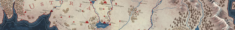
The map I created for the upcoming novel, Hope and Red, by Jon Skovron has been released by the author.
I didn't get to read the book, but the world was described as one of a sea empire, with a historical equivalent of New York in the 1800s. Jon provided several maps from the time period he was referencing for me to be inspired by. The kraken in the upper right, was originally created for a map I did for Masters of Malt. But since there's a Rum out there that uses the kraken for it's logo, I moved him over to this map, as Jon decided he needed a kraken in his map.
My friends at Orbit say it's a really fun read, so I'm looking forward to getting my copy when it's out.

Well done! The style is really nice because it does a great job of looking like something I would expect to see in the victorian era books. I've always liked that style.
Very nice map!
I love the elongated shape and the decorations. Make it look both time-appropriate and, for some reasong, slightly fairy tale-esque.
And the city is just great.
A fantastic piece of work that's deceptively simple at first look, but clearly has a lot of thought and work. Well done!
Thanks guys. The elongated form came from trying to capture a bit of the idea of a world edge, with the sun rising on one side, and setting on the other, since the oceans are called the Dawn Ocean, and the opposite the Dusk Ocean. Sort of like a globe.
Nicely done! I love all the sea monsters.
Cheers,
-Arsheesh
I like this a lot. The ships and monsters are fab, and the city in the bottom left looks great too. I rather wish there was more of a land mass in the main map area, but appreciate that's not down to you. The style and colours are very appealing and the whole thing would definitely make me take a long look at the novel.
"We are the music makers, and we are the dreamers of dreams"
Efficient map! Not a big fan of the map itself, but I love the frame, the sea monsters, the key and the town view. All those elements add a lot, giving a ambience and purpose to the map itself.


