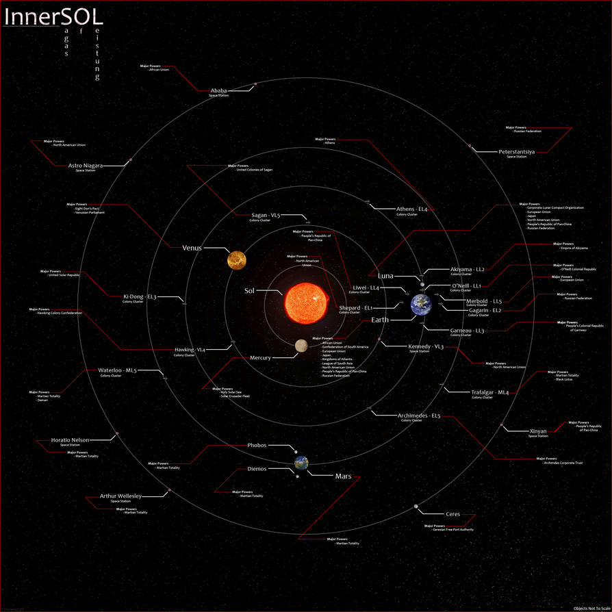
I like the general feel of it and the labels; very nice! Shouldn't Mars be red? Or has it been terraformed?
Hi there! This is the latest incarnation of a map for a campaign setting I created a while back. The map details the Inner Solar System and the colonies mankind has created.
I'm looking for any criticism or tips you may have
New System.jpg

Last edited by elemental_elf; 03-09-2011 at 01:37 AM.
I like the general feel of it and the labels; very nice! Shouldn't Mars be red? Or has it been terraformed?
Looks like it got terraformed to me. Quite a sweet map there.
Oh, and have a rep.
Last edited by Master TMO; 03-09-2011 at 03:21 PM.
My Finished Maps | My Planet Maps | My Challenge Entries | Album: Pre-generated Worlds
------
Assuming I stick with fantasy cartography, I'd like to become a World Builder, laying out not only a realistic topography, but also the geopolitical boundaries and at least rough descriptions of the countries and societies.


Very cool. I love the political relationships.
I am the breath of Dragons...The Song of Mountains...The Stories of Rivers....The Heart of Cities.... I am A Cartographer....
Finished Maps
Kingdom Of Shendenflar Campaign Setting (WIP)

Everything I post is free for use and redistribution under the Creative Commons Attribution-Noncommercial-Share Alike 3.0 licence, except where noted otherwise in the thread.


That's great work; very clean and precise, and (most important) easily readable. You do have a lot of 'empty space' that you could fill up in some way. Maybe with the flags of the various political entities?
Thank you all for your comments, I really appreciate each and every one!
I tried adding a line of flags to the top to help "fill the empty space". I'd love some feedback on it. I have another line of flags I could add but I'd rather know if the first looks acceptable before I go to the effort of resizing the remaining flags.
New System with flags.jpg


The flags are a great touch IMO they might look better if they were centered along the top. You could move the map title to the bottom of the map.
I am the breath of Dragons...The Song of Mountains...The Stories of Rivers....The Heart of Cities.... I am A Cartographer....
Finished Maps
Kingdom Of Shendenflar Campaign Setting (WIP)

Everything I post is free for use and redistribution under the Creative Commons Attribution-Noncommercial-Share Alike 3.0 licence, except where noted otherwise in the thread.


I agree with jtougas r.e. centering the flags and moving the title to the bottom. Also, there are some space stations etc. that seem to be independent; what about putting their flags next to the actual entity in the map itself, rather than along the borders? It might add some more visual pop to the whole project.

Sweet map there. I love the addition of the "Island 3" type orbital colonies.
Maps encourage boldness. They're like cryptic love letters. They make anything seem possible.
-Mark Jenkins

Looks pretty good, and mostly makes scientific sense.
However, I don't know why anyone would build colonies on Venus and Mercury, since on Mercury hospitable temperatures could only exist very near the poles, and Venus destroys robotic probes within a couple hours (Not to mention that launching a rocket from Venus would be extremely difficult. The thick atmosphere would create massive drag forces.
Colonies orbiting Venus might be possible, but I don't understand why anyone would want to build them there, since there's plenty of perfectly good empty space at Earth distance or greater.