Results 1 to 10 of 10

Thread: City of Tallon Map, Facelift

  1. #1
    Professional Artist keithcurtis's Avatar
    Join Date
    May 2007
    Location
    Port Angeles, WA
    Posts
    56

    Map City of Tallon Map, Facelift

    Hey folks,

    My commission schedule finally has slowed down enough to let me work in a few personal projects. I've been working a lot with painted-style textures, and have applied that to my pet city project.

    The full map is here.
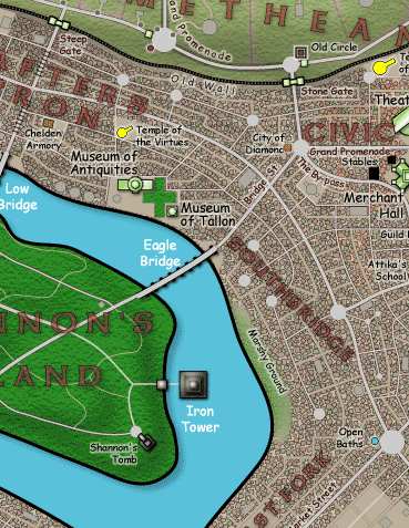
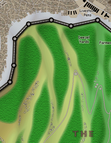
    To give you an idea of what has been done, here is a before and after comparison of some of the tiles:

    Before

    After

  2. #2
    Community Leader RPMiller's Avatar
    Join Date
    Apr 2006
    Location
    Watching you from in here
    Posts
    3,226

    Default

    I'm loving the effect on the vegetation. Not so keen on the buildings though. I think it softens them too much and the fact they are buildings becomes lost to some extent.

    Speaking of farm land. I need a decent looking seamless tile of a cultivated field. If you can offer any tips can you PM me so that we don't derail the thread?
    Bill Stickers is innocent! It isn't Bill's fault that he was hanging out in the wrong place.

    Please make an effort to tag all threads. This will greatly enhance the usability of the forums.


  3. #3
    Administrator Facebook Connected Robbie's Avatar
    Join Date
    Mar 2006
    Location
    Dayton, OH
    Posts
    3,877
    Blog Entries
    6

    Default

    Thats a HUGE improvement to something I thought couldn't be improved upon. Your maps were some of the best functional maps I've seen...with this now they've gone beyond functionality and you've gone right after my own heart which is the artistic side of cartography...because you can't have cARTography without ART.

    That was pretty cliche sounding huh?
    Fantaseum (https://www.fantaseum.com)

    Robbie Powell - Site Admin

  4. #4
    Professional Artist Facebook Connected kalmarjan's Avatar
    Join Date
    Jun 2007
    Location
    Montreal, Quebec, Canada
    Posts
    99

    Praise

    Very nice.

    Unless I miss my guess, the furrows on the fields were done with a slight bevel?

    Sandeman
    What???? You mean there is NO MAGIC RENDER BUTTON!

  5. #5
    Professional Artist keithcurtis's Avatar
    Join Date
    May 2007
    Location
    Port Angeles, WA
    Posts
    56

    Default

    RPMiller
    Thanks, the buildings were one of the last things I changed. After I had gone more paint-textured with everything else, they really stood out as a vector-based texture. Basically, I took the texture, pasted into photoshop, added a drop shadow, and a bevel, to make them look roofed. At the current magnification, they look a bit more lumpy than I would like. Perhaps a bit of an outline would make them stand out as individual objects. I'll have to be careful not to make it overall too dark, though.
    See below for the furrows.

    Arcana
    Thanks! Yes, now that the functionality is there, I can work on the prettiness. I really can't add too much more detail, or important things will be lost in a sea of trivia.

    kalmarjan
    I considered a bevel, but they're tricky in Illustrator. They also take up rendering time. Also to keep down the render time, I didn't want to go with a drop shadow on each object. Each one is basically a multilayered line, saved as a Style. The top line is dotted and bright green and very narrow, the crops. The next line is a duller green-solid and round-ended, the row. The bottom layer is the same green set to Multiply (and thus darken the ground texture behind, with a slight offset down and to the right. At the resolution at which it is displayed, it simulates a rounded furrow without the necessity of using raster Effects.

  6. #6
    Professional Artist Facebook Connected kalmarjan's Avatar
    Join Date
    Jun 2007
    Location
    Montreal, Quebec, Canada
    Posts
    99

    Praise

    Praise X2!

    You did this in Illustrator? You got some rep from me JUST for that. I just cannot seem to get the hang of Illustrator, I am more of a Raster guy. (PS and stuff.)

    Sandeman
    What???? You mean there is NO MAGIC RENDER BUTTON!

  7. #7
    Professional Artist keithcurtis's Avatar
    Join Date
    May 2007
    Location
    Port Angeles, WA
    Posts
    56

    Default

    Quote Originally Posted by kalmarjan View Post
    Praise X2!

    You did this in Illustrator? You got some rep from me JUST for that. I just cannot seem to get the hang of Illustrator, I am more of a Raster guy. (PS and stuff.)

    Sandeman
    A combination of Illustrator and PhotoShop. The bulk of the work is done in Illustrator, and in fact the previous map was entirely Illustrator. The current maps uses a lot of textures created in PhotoShop, imported into Illustrator as patterns or objects. It's much, much easier to make changes, both individual and global in Illustrator.

    Had I done the project entirely in PhotoShop, there is no way I would have tried the facelift.
    Last edited by keithcurtis; 10-16-2007 at 03:59 AM.

  8. #8
    Guild Member Talamar's Avatar
    Join Date
    Apr 2006
    Location
    Germany
    Posts
    52

    Default

    What the hell?
    This one is really really awesome.
    Something of the best I have ever seen. I love that.
    Come to where the kobolds are...
    www.dnd-gate.de - The German D&D Community

  9. #9
    Community Leader RPMiller's Avatar
    Join Date
    Apr 2006
    Location
    Watching you from in here
    Posts
    3,226

    Default

    Quote Originally Posted by keithcurtis View Post
    RPMiller
    Thanks, the buildings were one of the last things I changed. After I had gone more paint-textured with everything else, they really stood out as a vector-based texture. Basically, I took the texture, pasted into photoshop, added a drop shadow, and a bevel, to make them look roofed. At the current magnification, they look a bit more lumpy than I would like. Perhaps a bit of an outline would make them stand out as individual objects. I'll have to be careful not to make it overall too dark, though.
    See below for the furrows.
    I think that would be a good direction. When I look at the larger circular, and rectangle buildings they really stand out as buildings so I think that a bit of an outline would definitely give the smaller buildings a bit more definition.

    It really is a tough call though. Going back and looking at it again, I'm liking the buildings a little more, but I still go with my first impressions. That said, I still love the vegetation changes. Those are just beautiful and gives the landscape a lot of character.
    Bill Stickers is innocent! It isn't Bill's fault that he was hanging out in the wrong place.

    Please make an effort to tag all threads. This will greatly enhance the usability of the forums.


  10. #10
    Community Leader pyrandon's Avatar
    Join Date
    Feb 2007
    Location
    Michigan, USA
    Posts
    1,341

    Default

    I'm backing up RP's assessment, Keith: the colors are much more pleasing to the eye, and the grass/fields are awesome. But the buildings are too blobby; IMO worse than the original--although I see why you changed the style to fit the new map. I wonder if sharpening as you've said will help--as well as doing something so the roads do not seem "floating on top of" the structures vs. between them on the ground? Shadows and such would help, as would blurring the roads. A similar situation occurs with the walls & towers: they are still too vector in my mind to fit the more organic style of the rest.

    Just some ideas, Keith. No matter what you decide to do this will still be an amazing map!
    Don
    My gallery is here
    __________________________________________________ _______
    "Keep your mind in hell, but despair not." --Saint Silouan [1866-1938]

Posting Permissions

  • You may not post new threads
  • You may not post replies
  • You may not post attachments
  • You may not edit your posts
  •