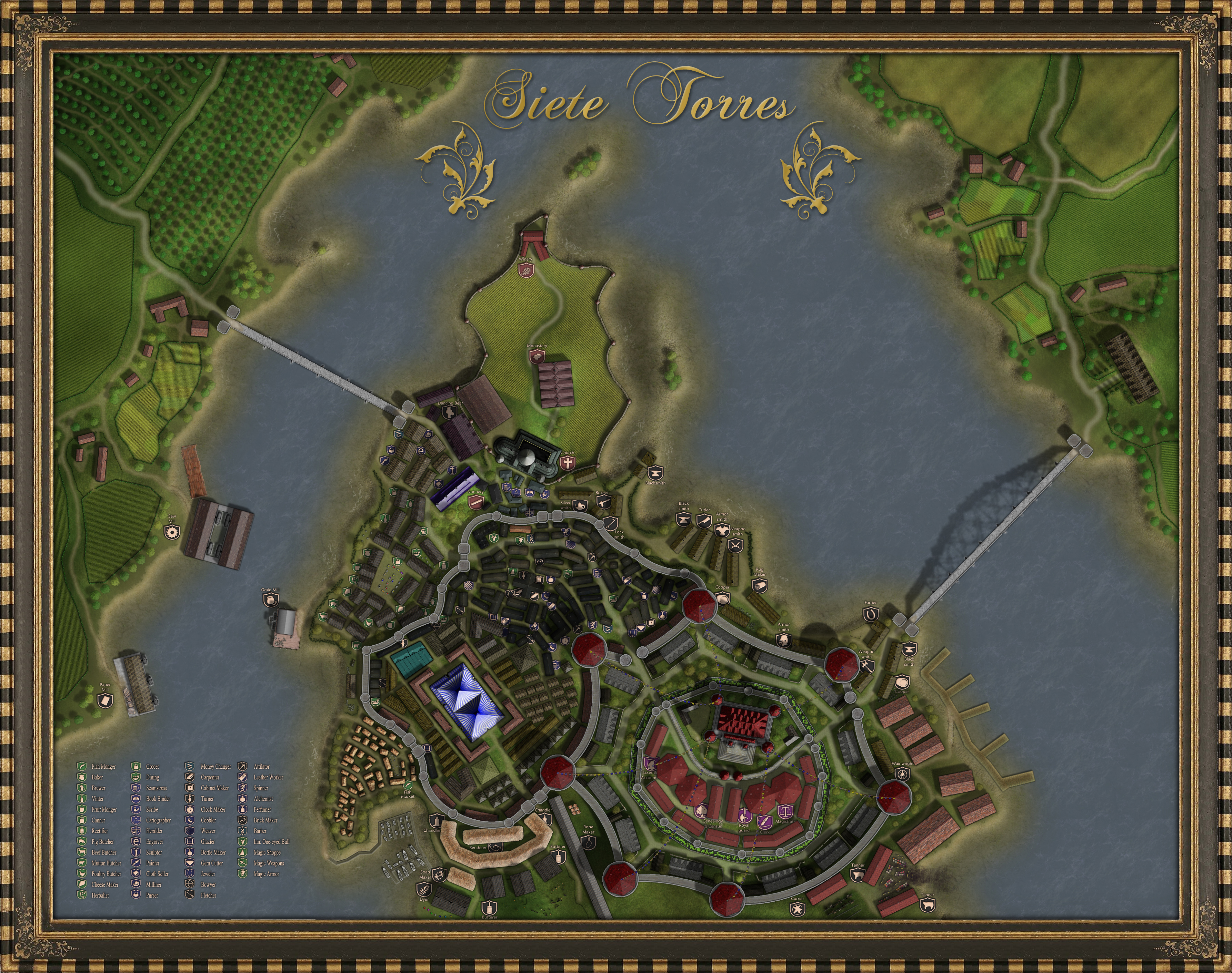
Okay this is potentially the final version with frame and title. I reserve the right to tinker with it, but I think it's releasable as it. Please let me know if you see something that proves me wrong.
### Latest Wip ###
Siete Torres Final.jpg


Looking good!
The only thing I can see is that the trees on the east bank don't seem to match the trees on the west bank ... they're all very green, where the west bank trees are a more natural mix of green and yellow.
I could also wish for more little buildings in the residential quarter, but with the limited space I could see townhouses/tenements taking over, so that's not too bad.
Gidde's just zis girl, you know?
My finished maps | My deviantART gallery
My tutorials: Textured forests in GIMP, Hand-Drawn Mapping for the Artistically Challenged


Okay this is potentially the final version with frame and title. I reserve the right to tinker with it, but I think it's releasable as it. Please let me know if you see something that proves me wrong.
### Latest Wip ###
Siete Torres Final.jpg
That's a very nice frame Immolate! And it does look like it's finished. Overall a stunning looking map. Love the castle with the flags.
My only criticism would be that the layout of the city doesn't look too convincing to me.
Check out my City Designer 3 tutorials. See my fantasy (city) maps in this thread.
Gandwarf has fallen into shadow...


Another kickass frame, very sweet.
If the radiance of a thousand suns was to burst at once into the sky, that would be like the splendor of the Mighty One...I am become Death, the Shatterer of worlds.
-J. Robert Oppenheimer (father of the atom bomb) alluding to The Bhagavad Gita (Chapter 11, Verse 32)
My Maps ~ My Brushes ~ My Tutorials ~ My Challenge Maps


There was some repetition-induced stutter in the frame so I fixed it as best I could. Stretching a frame is always a bit of a challenge, but I admit it's easier in Photoshop than in real life. Good frame stretchers cost top dollar and they're constantly breaking down.
It's bed time and work tomorrow takes me right through the deadline, so I can safely say this is the last update. Good luck challenge participants!
### Winner ###
Siete Torres Final.jpg
Last edited by ChickPea; 08-26-2018 at 08:16 AM.

Not that it is bad, but I can definitely tell that the houses you used to replace the ruins were placed in a hurry. Probably a little too much symmetry. It in no way detracts for the colossal effort and artistic merits of the map, but it is an amusing note.
Good luck Immolate. This is a beautiful map.


Thanks Nolgroth. It took perhaps five hours to create and place the houses, which is pretty quick I admit, but the effect I think is more from a poverty of imagination rather than a shortage of time. I was trying to crowd as many of them into the space as I possibly could, but in the end I think the map would have been better served if I had focused more on varying shape and size, and not so much about crowding and spacing.
I guess it's like everything else we do in mapping--a learning experience.


I was walking down memory lane and noticed that this thread didn't include the final revision which was too late for the contest. It's still out there on Deviant Art thirteen years later, and I so much love those final changes, which coincidentally addressed some of the complaints.

----------
My Deviant Art Map Gallery
DeviantArt: https://www.deviantart.com/turambar91