Umm... wow. Just wow.
-IG
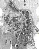
This is an old hand drawn map from 1990 or so that i thought i would give a new and more glamorous digital existence. This will be a side project to the Torentine Atlas maps. I just have to figure out how to breathe new life into the old thing, other than lose that horrible compass thing. I always hated it and now i think it looks satanic.. haha.
The name of the city WAS Imsys, but i have reused that name on my Torentine map.. so i will rename it. It's located at the mouth of a river and there is sort of a delta effect but some of the channels only flood during the rainy season. The rest of the year they are used for agriculture. Of course i will complete the areas that are unfinished.

Last edited by a2area; 12-13-2009 at 12:51 AM.
Umm... wow. Just wow.
-IG


Looks pretty nice to me. Maybe a lil confused with the monotone colors running together, thus providing no focal points, but a lil erasing will fix that...or colorNice work and I will look forward to what you do.
If the radiance of a thousand suns was to burst at once into the sky, that would be like the splendor of the Mighty One...I am become Death, the Shatterer of worlds.
-J. Robert Oppenheimer (father of the atom bomb) alluding to The Bhagavad Gita (Chapter 11, Verse 32)
My Maps ~ My Brushes ~ My Tutorials ~ My Challenge Maps
I didn't bother with scanning it in color because it will be a total redo and the colors were so faded. I will reduce all that grey and totally get rid of it leaving me with just the plan. I scanned it at a really high res also for easy editing and so i can get some nice roof detail and water textures etc. so it will be a huge map in full scale but i'll make the final a zoomed out version about the same size as the Torentine maps, I've always wanted to vectorize this city layout but i dont know if i am up to it. Maybe though (0:
Last edited by a2area; 12-13-2009 at 01:01 AM.

That's pretty nice. toss a parchment layer under that, then print it out as is, and it would make a wonderful player handout
I must say, with all the "i found this map from years ago and scanned it in" posts I read, this one floored me the most as an initial piece.
And I actually like the compass, it would work really well on my Darklands map
My finished maps
"...sometimes the most efficient way to make something look drawn by hand is to simply draw it by hand..."
I agree with Coyotemax. Definitely one of the better "i found this map from years ago and scanned it in" maps. Maybe even the best. Very impressive and can't wait to see you breath new life into it.
Check out my City Designer 3 tutorials. See my fantasy (city) maps in this thread.
Gandwarf has fallen into shadow...
It does look pretty amazing. Looking forward to seeing what you do with this digitized.
Royal: I'm very sorry for your loss, your mother was a terribly attractive woman.
My Cartographer's Guild maps: Finished Maps
More maps viewable at my DeviantArt page: Ramah-Palmer DeviantArt

Cool stuff..looking forward to seeing what you come up with.
My Finished Maps | My Challenge Maps | Still poking around occasionally...
Unless otherwise stated by me in the post, all work is licensed under a Creative Commons Attribution-Noncommercial 3.0 United States License.
Deuly amazed...looks great as it is. I can't wait to see what you come up with.

Incredible map. Wow.