Page 1 of 6 12345 ... LastLast
Results 1 to 10 of 59

Thread: Castle Plans

  1. #1
    Professional Artist Turgenev's Avatar
    Join Date
    Apr 2008
    Location
    Toronto, Canada
    Posts
    872

    Wip Castle Plans

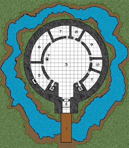
    When I'm not designing dungeons, I like to toy around with castle plans. Here is a design that is a work in process. It is inspired by Restormel Castle in Cornwall, England. This is the ground level. The upper level will contain the living area but I haven't finished it yet.

    Edit: I've adjusted the saturation levels on the grass & ground.

    Click on the image for the larger version:


    The Legend for the castle is as follows:
    1 Drawbridge
    2 Gate (with portcullis & reinforced doors)
    3 Open Courtyard
    3A Starirwell (Down)
    3B Stairwell (Up)
    4 Well
    5 Kitchen
    6 Storage / Pantry
    7 Temple
    8 Storage
    9 Stable
    10 Armoury
    11 Barracks

    Now to work on the 2nd level.
    Last edited by Turgenev; 04-24-2008 at 01:38 AM. Reason: Corrected Legend write-up / adjusted image
    Cheers,
    Tim

    Paratime Design Cartography

    "Do infants have as much fun in infancy as adults do in adultery?" - Groucho Marx

  2. #2

    Default

    Very nice design - I hope you don't mind a couple of suggestions:

    Try the map with the saturation of the colours toned down to about half what they are now.

    You could make the castle walls more interesting, by putting in slit windows, buttresses and columns etc.

    There is useful reference material on the site

    here: reference material
    here: stunning castle plans - all done in Microsoft paint!!

    It's worth having a root around the reference material bit of the site, there's quite a bit on castles there.

  3. #3
    Community Leader Torq's Avatar
    Join Date
    Jun 2007
    Location
    Cape Town, South Africa
    Posts
    894

    Post

    Turgenev, I hope you dont mind but I messed with your castle plan a bit. I was just experimenting with a few textures in the Gimp.

    Torq
    Attached Images Attached Images
    The internet! It\'ll never catch on.

    Software Used: Terranoise, Wilbur, Terragen, The Gimp, Inkscape, Mojoworld

  4. #4
    Guild Adept Valarian's Avatar
    Join Date
    Apr 2007
    Location
    Worcestershire, UK
    Posts
    331

    Question

    Quote Originally Posted by Turgenev View Post
    3A & 3B Stairwell
    Is A down and B up? If not, I'd check the rotation of the stairwells.
    Google Groups for FGII Games:
    European FG2 RPG - Fridays & Sundays (8pm UK time)
    Using Ultimate FGII and can accept unlicensed player connections on some of the games

  5. #5

    Default

    Something to do with the person fighting down the stairs having more room to manuoevre his sword arm, isn't it? So if you're going up the stairs it turns right making it more difficult to use your sword.

    Nice makeover Torq, about time you posted a tutorial with that technique of the rocks and grass.

  6. #6
    Community Leader RPMiller's Avatar
    Join Date
    Apr 2006
    Location
    Watching you from in here
    Posts
    3,226

    Default

    I think it is the other way around, and there is no "up" and "down" on stairs unless they move on their own accord.

    The idea is that the defender is higher and can use the center of the spiral along with a shield to have overwhelming defense while having the larger arc of the outside wall to swing a sword and maneuver a longer weapon such as a short spear.

    Of course if you are left handed things don't work out quite right.
    Bill Stickers is innocent! It isn't Bill's fault that he was hanging out in the wrong place.

    Please make an effort to tag all threads. This will greatly enhance the usability of the forums.


  7. #7
    Community Leader Facebook Connected torstan's Avatar
    Join Date
    Jul 2007
    Posts
    4,199

    Post

    Yep - used to tour guide in a castle. If B is upstairs and A is downstairs it is correct. Stairs rise clockwise.

  8. #8
    Professional Artist Turgenev's Avatar
    Join Date
    Apr 2008
    Location
    Toronto, Canada
    Posts
    872

    Post

    Thanks for the suggestions guys. Love what you did with the map, Torq. I'll be definately giving that a try. As for windows/slits... that will be on the 2nd level. Ground level was suppose to be just solid walls. At least that was my plan. As for the stairs, to be honest I didn't even think about it. My original idea was they both went up but now I have something to think about. I think I will go with torstan's comment and have B = upstairs and A = downstairs. Thanks again for the links and suggestions.
    Cheers,
    Tim

    Paratime Design Cartography

    "Do infants have as much fun in infancy as adults do in adultery?" - Groucho Marx

  9. #9

    Post

    Very nice, classic design. I love maps where I can believe they would actually be built. Fantastic, improbable elements, have their place but believability wins out in the end IMHO. A good design makes me think "Castles like this would exist" - makes presenting them, much, much easier.


    I actually prefer Turgenev's version where all the elements have the same treatment. To do the outside without showing kindness to the inside of the tower creates an odd sense of imbalance.

    SO, I added a tiny touch to the inside of the tower. A pattern and a complimentary drop shadow - to match the outside.

    Torg's mod of Turg's map modded by someone whose name doesn't start with "T"
    Last edited by Sigurd; 04-23-2008 at 02:52 PM.

  10. #10
    Administrator Redrobes's Avatar
    Join Date
    Dec 2007
    Location
    England
    Posts
    7,244
    Blog Entries
    8

    Post

    Clockwise going down...


    (BTW - nice castle map !)

Page 1 of 6 12345 ... LastLast

Tags for this Thread

Posting Permissions

  • You may not post new threads
  • You may not post replies
  • You may not post attachments
  • You may not edit your posts
  •