Reply With Quote
love the color sceme - but I liked the more "comic" map more - comic and hip hop goes well together and it also gave a much more distinct look to the map

Looking great all around. Can't wait to see the finished product.
"Listen, strange women lyin' in ponds distributin' swords is no basis for a system of government."
My Albums - My Portfolio


love the color sceme - but I liked the more "comic" map more - comic and hip hop goes well together and it also gave a much more distinct look to the map
regs tilt
:: My DnD page Encounter Depot free stuff for your game :: My work page Catapult ::
:: Finished Maps :: Competion maps - The Island of Dr. Rorshach ::
:: FREE Tiles - Compasses :: Other Taking a commision - Copyright & Creative Commons ::
Works under CC licence unless mentioned otherwise
Since you are going for Hip/Hop I would think you want the Comic/Graffiti look. Still, it's looking really good.
When its over and you look in the mirror, did you do the best that you were capable of? If so, the score does not matter. But if you find that you did your best you were capable of, you will find it to your liking. -John Wooden
* Rivengard * My Finished Maps * My Challenge Maps * My deviantArt


Looking for suggestions.
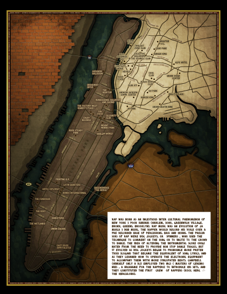
I'm adding a fairly big blurb of informational text to the map. Since the locations on the map are only on Manhattan and the Bronx, I have all of Queens/Brooklyn (bottom-right) to use as I wish. This blurb of text - I'm having trouble thinking of substrate for it. My first thought was brick wall - but with the top left brick, it's too much. Second thought was records, but they would appear out of place. 3rd thought was an original style flyer like the attached samples, but I also think they would be out of place.
Any suggestions from this group? Like parchment? or maybe a city skyline w/ close up billboard w/ text blurb on it?
hmm..
maybe a brick wall with a flyer attached to it? That may be it?
Liking the colors more and more. I've been wondering what mine would look like if I Sepia'd it.
When its over and you look in the mirror, did you do the best that you were capable of? If so, the score does not matter. But if you find that you did your best you were capable of, you will find it to your liking. -John Wooden
thanks Jax - I've decided to go with the flyer in the bottom left. These flyers were actually a huge part of the early hip hop movement. These artists created them with ink pen, rulers, and stick on letters. Some of them are very detailed. They took serious pride in the flyers, the same way we do in our maps. So it's fitting to include a flyer graphic on the hip hop map.
Anyway - I've started it tonight. I'm getting close to finishing the map - and it's been a ton of fun. Here's where i've gotten with the flyer. Creating it in illustrator and placing it into the photoshop map.
Also - I plan on going into the city the wed before thanksgiving. I'm pretty sure that the maps will be on display then (and hope mine will be there), so I'll get to see it. I'll take pictures of everything I see though -
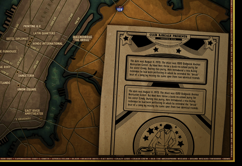
Pretty cool map, although the cut on the bottom of the flyer could have gone a bit lower?
looking really good - and cool flyer ... makes me think back to when I had to technics 1210 with Stanton pickups in my living room - and speakers the size of houses *lol*
regs tilt
:: My DnD page Encounter Depot free stuff for your game :: My work page Catapult ::
:: Finished Maps :: Competion maps - The Island of Dr. Rorshach ::
:: FREE Tiles - Compasses :: Other Taking a commision - Copyright & Creative Commons ::
Works under CC licence unless mentioned otherwise
I may have extremely small tweaks in the next day or two, but I doubt it, because it's halloween weekend and I have 3 small kids and we're jam packed with exciting scary stuff to do.
Overall I'm happy with this map, but If I could do it over, I would have not left so much empty areas in queens & brooklyn. Problem is I only wanted to include streets and locations that have meaning. Not just random area names to fill up space. I'm also happy with the feel of the map. I was going for something that could be displayed in an underground record shop or somewhere that hip people might appreciate. I don't think the average person will get this.
If anyone see's any type-o's or something blatenly wrong - please call it out and I'll try and correct. Thanks all - this was really really fun.
(edit)
O yeah - i spent a lot of time on the flyer, and it came out looking authentic, but I just couldn't get it to fit into the map. If I had more time, I may have created a whole street scene in the lower right, and had the flyer taped to a light post or something, but for now - this is what it is.
### Latest WIP ###
Last edited by RjBeals; 10-28-2010 at 10:17 PM.
Well that just came out excellently. It looks really nice and I can totally see it on a record store wall.
If we don't get 45 maps I don't think anything will be showing will it?
When its over and you look in the mirror, did you do the best that you were capable of? If so, the score does not matter. But if you find that you did your best you were capable of, you will find it to your liking. -John Wooden
 Posting Permissions