Reply With Quote
the tree icons seem to work nicely with the mountain style- i'd say maybe adding a light toned ground of the same color could work too, but it looks pretty good as is.


I don't think it looks too busy. I love this tree method. It looks completely natural with the rest of the map, and has the added bonus of not interfering with the labels/information. I'd say go with it.
Gidde's just zis girl, you know?
My finished maps | My deviantART gallery
My tutorials: Textured forests in GIMP, Hand-Drawn Mapping for the Artistically Challenged
the tree icons seem to work nicely with the mountain style- i'd say maybe adding a light toned ground of the same color could work too, but it looks pretty good as is.
Who is John Galt?
A big preview.
What do you guys think of the paper texture? I am slowly inching my way towards something I'm happy with.
The writing is hand-lettering, with the tablet. I have horrible hand-writing.
thinking about how to write all of this. i can only write straight lines, and then post-process them with rotate and scale. gaah.
I don't think you have horrible handwriting, the lettering looks great! The paper texture ... well, I think it looks more like leather or plaster than paper. There's no fiber-type feel to it.
Gidde's just zis girl, you know?
My finished maps | My deviantART gallery
My tutorials: Textured forests in GIMP, Hand-Drawn Mapping for the Artistically Challenged
how papery does it need to feel? I like this texture because its pretty unobtrusive, but Gidde's right about it feeling more like plaster.
Everything being in color helps to clear up most of the confusion i was having before with the different chart overlays, so thats good.
Whats the plan for the four triangular corner pieces?
Who is John Galt?
Originally Posted by vman3force

Maybe i'll just say it's parchment.
The triangular pieces will get at least a cosmic model showing the world from the side, and possibly other mythological realms beyond the corporeal world. Maybe a star map in a different projection and star names.
EDIT:
I'll describe how I got this particular texture. First I create a white layer on which I use some noise (Hurl, which randomises pixels: "remove alpha channel" and desaturation and you have a pretty random layer, there's probably a better way to do this), then I use GIMPressionist to create a random furry texture. This is then used as the base of a (duplicated layer) emboss, which gives a bit of a third dimension. I really thought it looked quite papery...
Last edited by Naeddyr; 01-26-2011 at 04:58 AM.
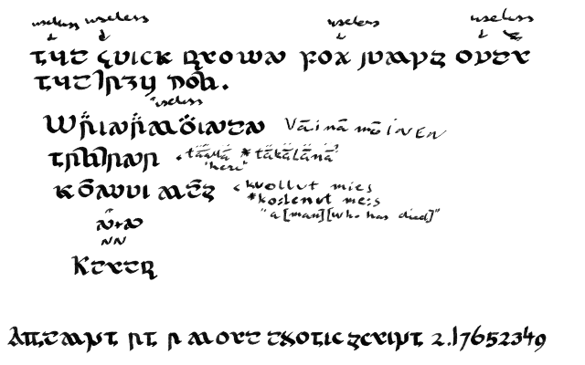
Someone pointed out (somewhat rightly, but not horribly rightly, just kinda sorta) that the combination of mountains and a hand-written script with uncial and other old-timey features might be construed as a bit too tolkienian (not that Christopher Tolkiens map used anything but small caps and grumble grumble damn movie tie ins), so I decided to go full throttle and device a much more exotic latin script than what I previously used.
For the record, I didn't think it looked too Tolkienesque (and I share your grumbles). On the phone so I can't look at the new script properly, but from what I can see it looks really cool.
Gidde's just zis girl, you know?
My finished maps | My deviantART gallery
My tutorials: Textured forests in GIMP, Hand-Drawn Mapping for the Artistically Challenged


Somehow I had missed this thread.
Excellent looking map, Naeddyr, with a lot of detail.
Thanks, Sapiento.I'm stuck in a bit of a rut right now (my computer was broken this past weekend because my brother's motherboard borked, and when I tried out what parts were broked in the new setup we bought by testing them in my own computer I broke it too...) because I stopped working on it, and it's hard to get up back to speed. Also, I am unsatisfied with the methods available to me re: lettering. I need a printer/scanner.
 Posting Permissions