Page 5 of 12 FirstFirst 123456789 ... LastLast
Results 41 to 50 of 117

Thread: Elyden map

  1. #41
    Community Leader Guild Sponsor Gidde's Avatar
    Join Date
    May 2009
    Location
    Michigan, USA
    Posts
    3,673

    Default

    Looking good! The only thing that's bothering me is the labels. They look stretched (although that could be the font) and they really ought to be curved/angled/something, imho. I'm also generally not a fan of underlines, but that could just be because I spend so much time on the web that underline==link in my brain, hardwired at this point.

  2. #42
    Guild Expert Facebook Connected vorropohaiah's Avatar
    Join Date
    Feb 2010
    Location
    Malta
    Posts
    1,425

    Default

    Quote Originally Posted by Gidde View Post
    Looking good! The only thing that's bothering me is the labels. They look stretched (although that could be the font) and they really ought to be curved/angled/something, imho. I'm also generally not a fan of underlines, but that could just be because I spend so much time on the web that underline==link in my brain, hardwired at this point.
    Do you think they should be curved with the graticules or the terrain? I was planning on the former but thought the higher latitudes might be a bit too curved. I believe the font is stretched at 120% though that was just because I thought they looked better... Maybe not? The underline is because a bold font 'distorted' too much

  3. #43
    Community Leader Guild Sponsor Gidde's Avatar
    Join Date
    May 2009
    Location
    Michigan, USA
    Posts
    3,673

    Default

    I'd curve/angle them with the terrain. It ends up looking more natural.


    Sent from my iPhone using Tapatalk

  4. #44
    Guild Expert Facebook Connected vorropohaiah's Avatar
    Join Date
    Feb 2010
    Location
    Malta
    Posts
    1,425

    Default

    Quote Originally Posted by Gidde View Post
    I'd curve/angle them with the terrain. It ends up looking more natural.
    I'm trying out orienting the text with the 'horizontal' graticules - not really traditional though i thought I'd try it out. I don't mind the results and think its' a bit more characterful than plain horizontal, though I'm still experimenting (same with the font itself. I tried Castellar and Imprint MT Shadow, which i thought looked cartographical, but decided against them in the end). suggestions are welcome


    Here's a new iteration of the map. I discarded the coastline I had generated through the projection generator and repalced it with the original one and then painstakingly went through the graticules one-by-one, stretching them out and placing them on the equirectangluar base map (I'm sure there's another generator somewhere tpo do that but ah well...).

    I normally like to come up with nations' histories before plotting cities/capitals/features in the map, though that was taking too long (each region was winding up with a 10,000+ word-history which was taking too long - I'm getting impatient to get the map done - i can always update it once I amend regional histories :p I finally settled on a border design, and once the 'boring' part of adding all the fiddly regions and text is done i can start with the fun stuff - colouring it in, adding texture and grunge effects (though I'm not sure i want it being too colourful,and I'll probably settle for something more 'realistic - 18th century-esque. we'll see

    the attachment is a bit more detailed than the embedded pic, though i had to resize if from 300 dpi down to 72, so its lost a lot of detail
    Attached Thumbnails Attached Thumbnails Click image for larger version. 

Name:	NEW - inner sea - map.jpg 
Views:	177 
Size:	4.23 MB 
ID:	45465  
    Last edited by vorropohaiah; 06-07-2012 at 03:46 PM.

  5. #45

    Default

    Great work on the latest version of your map, I like the new orientation of the text, it looks good to me.
    I should have known that you had whole histories of the nations you were mapping in your head! Hope you will share them too. 
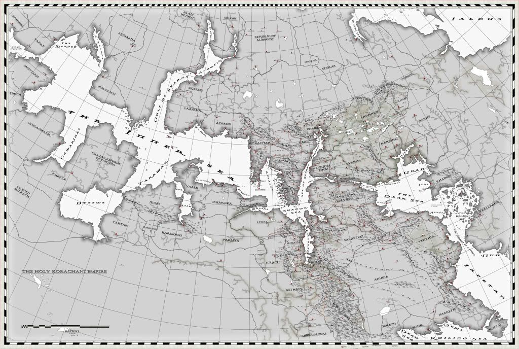
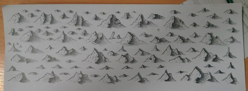
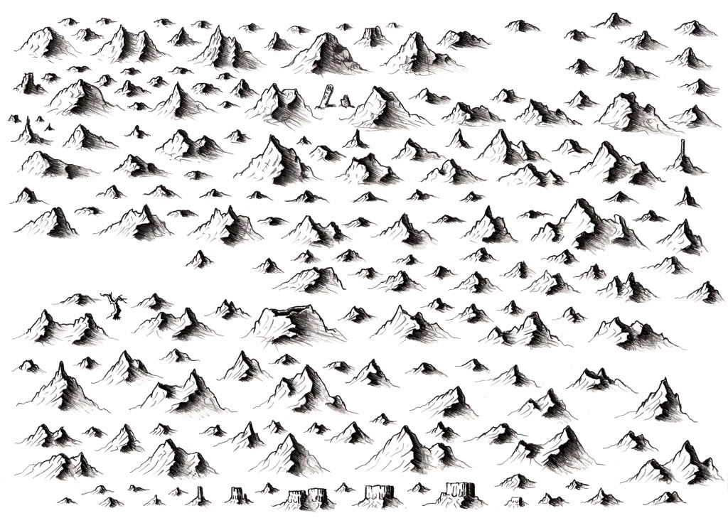
Anyway, I'm glad that you decided to fill in the blanks later, the map is worth seeing.

  6. #46
    Guild Expert Facebook Connected vorropohaiah's Avatar
    Join Date
    Feb 2010
    Location
    Malta
    Posts
    1,425

    Default

    to show that im still working on this... a snap of some quick mountain/tree sketches to try and figure out a style im happy with. I'll keep on trying...

    note the dead trees; horsetails (those crappy oddly stacked-umbrella-like-things under the trees) and the mesas... Elyden is a dying and harsh world so im trying to convey that with these. im also thinking of making the map look more hand-drawn and as such have applied brush spatter effects to most lines and will probably be overpainting the land outline and rivers too. ill probably draw up a few A4 sheets of mountains, trees and other features and scan those for use as brushes on the map.

    Im not sure whether or not to keep this sketchy look ar to at least try and refine them a bit (maybe with a fine liner pen?)
    C&C please!


    Edit, added another WIP pic


  7. #47

    Default

    I really like those mountains! The mesas and dead trees look fine too. I think one usually has to mess with the style a little till he finds something he is really satisfied with. That's at least how it is usually with me. Takes trial and error till I get something I really like.

  8. #48

    Default

    Very nice! I like the sketchy look.

    Cheers,
    -Arsheesh

  9. #49
    Guild Expert Facebook Connected vorropohaiah's Avatar
    Join Date
    Feb 2010
    Location
    Malta
    Posts
    1,425

    Default

    Quote Originally Posted by Lyandra View Post
    I really like those mountains! The mesas and dead trees look fine too.
    Quote Originally Posted by arsheesh View Post
    Very nice! I like the sketchy look.
    thanks. so, i finished off the first A4 page and went over the pencil work with subtle rapidoliner pens (0.2, 0.5 and 2mm sizes) and have started work on the next, which will be odder shapes and mesas and buttes etc to sprinkle around certain areas. im also trying to figure out how best to place the maps on the page - and will probably settle on a darken blend mode with another layer underneath where ill apply some highlighs.

    I've attached the jpg if anyones interested in using them (they can easily be cropped and used as brushes)
    Attached Thumbnails Attached Thumbnails Click image for larger version. 

Name:	mountain brushes.jpg 
Views:	189 
Size:	1.78 MB 
ID:	45597  

  10. #50
    Guild Master Chashio's Avatar
    Join Date
    Jan 2011
    Location
    Maine, USA
    Posts
    2,235

    Default

    Wow. This whole project, wow. =) Reps your way.

    I'm interested to see how you incorporate your mountains and trees on the maps. I have trouble with forests.

    One nitpick: The labels in the lower right corner (Molachari Desert, etc) seem too stretched horizontally, too flat vertically, and/or too warped for the space, which is more broad and empty.
    Last edited by Chashio; 06-15-2012 at 01:50 PM.
    Kaitlin Gray - Art, Maps, Etc | Patreon | Instagram

Page 5 of 12 FirstFirst 123456789 ... LastLast

Tags for this Thread

Posting Permissions

  • You may not post new threads
  • You may not post replies
  • You may not post attachments
  • You may not edit your posts
  •