Page 9 of 12 FirstFirst ... 56789101112 LastLast
Results 81 to 90 of 117

Thread: Elyden map

  1. #81
    Professional Artist Facebook Connected Schwarzkreuz's Avatar
    Join Date
    Oct 2011
    Location
    Leipzig/Berlin
    Posts
    1,636

    Default

    Can you post a new image of how its looking now?

  2. #82
    Guild Expert Facebook Connected vorropohaiah's Avatar
    Join Date
    Feb 2010
    Location
    Malta
    Posts
    1,425

    Default

    Quote Originally Posted by Schwarzkreuz View Post
    Can you post a new image of how its looking now?
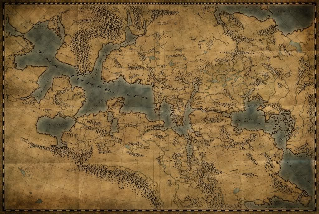
    well the true map is still greyscale as I'm not yet done adding in nations and keys etc., though the current 'colour-test' (since that's what im concentrating on at the moment) stands like this (though im basing this off of an older version of the grey-scale map, so the mountain highlights are now done and various un-keyed regions have now been completed also):


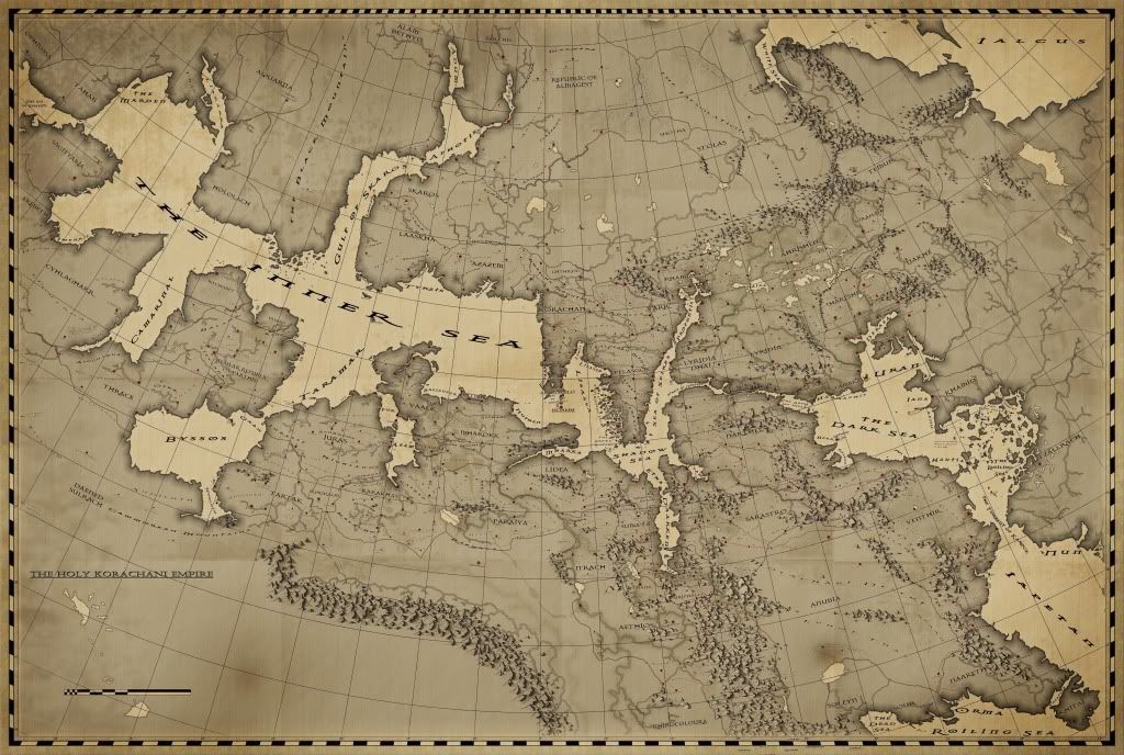
    Though I must say I am not 'feeling it' very much. I'm thinking of going back and changing it to something more akin to the below image which i made quickly now based off of an older version of the map, which I feel shows off the type of era (18th - 19th century) that the setting currently stands in (i agree with some people here who have said the image above looks like an antique map, which is good in and of itself all, but it really shouldn't be, based on the year and nation in the setting that I was meant to have been produced in in-world it's like saying a functional (not artistic or replica-antioque) mpa produced today looking like something from the Atlas Maior, which just doesnt make sense. not too sure im explaining myself correctly though .

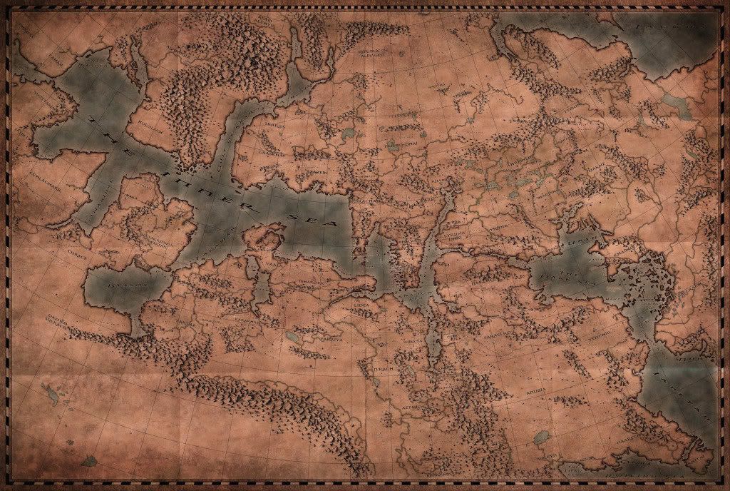
    The same stands for the mountains, though I'm having difficulty trying to figure out hat style they should otherwise be im. I'll probably finish off the greyscale version and cook up 2 variant colour overlays - one more subtle, 18th - 19th century looking and another one with the grungy colours and take it from there. or perhaps a cross between the two? its amazing what a bit of burn around the page edges and some subtle paper texture can do, even to a grey-scale map (perhaps with a small amount of colourised hue/saturation to bring out some discolouring in the paper).


    Please let me know what you think or of any suggestions as im struggling at the moment, trying to find an identity for the map!
    Attached Thumbnails Attached Thumbnails Click image for larger version. 

Name:	NEW - inner sea - map.jpg 
Views:	1075 
Size:	4.39 MB 
ID:	46286   Click image for larger version. 

Name:	colour test new.jpg 
Views:	1873 
Size:	4.62 MB 
ID:	46287  
    Last edited by vorropohaiah; 07-04-2012 at 02:16 AM.

  3. #83
    Guild Expert Facebook Connected vorropohaiah's Avatar
    Join Date
    Feb 2010
    Location
    Malta
    Posts
    1,425

    Default

    here's a slightly colour-corrected (or should i say altered) version. its a bit redder and slightly less saturated


    im still thinking of going for something thats between the two pics in the previous post, with just a hint of colour and less weathering. any thoughts? please?

  4. #84

    Default

    Personally, I'd agree with the less weathering. I notice that the weathering tends to draw my eyes more than the map features itself, which I think is a detriment to the great art you have here. As for the coloration, I think that is mostly personal taste. For me, I like the tan color test, though I think I would lighten the color some and go for a more blue than grey water. JMHO. Otherwise, amazing map. I hope to some day get even half this good.

  5. #85
    Guild Adept Seraphine_Harmonium's Avatar
    Join Date
    Apr 2011
    Location
    Poughkeepsie, NY USA
    Posts
    387

    Default

    Of the three images on this page, I like the first, top one the best. I like the blue water. You can instantly tell where the land and water are. The second one I have to look at for a second or two before I can make out what is what. So I'd start with the top one. You could desaturate it a bit, but I'd definitely keep it two-toned with the blue. I think the weathering looks fine and natural. It doesn't distract me at all.

    And the red one just looks weird.

  6. #86
    Professional Artist Facebook Connected Schwarzkreuz's Avatar
    Join Date
    Oct 2011
    Location
    Leipzig/Berlin
    Posts
    1,636

    Default

    I totally agree with seraphine in this topic. You could do this Map like an artistic 16th century Map and than use the Files to do a 18th C Map later. You had already put so much Accord into this Beautiful Map so don't trash it

  7. #87
    Guild Expert Facebook Connected vorropohaiah's Avatar
    Join Date
    Feb 2010
    Location
    Malta
    Posts
    1,425

    Default

    Thanks for the feedback people, much appreciated

    I'll be making an older '16th century' style map first (as that's also what will look nicer on my wall once its done!) But will later do the more 'technical/official' more recent one later (which I can work with in a more manageable resolution as its not intended for print, which will make work easier)... Of course that just means relabelling the whole thing and sorting coastlines to match the world's history but I'm a sucker for punishment!
    Last edited by vorropohaiah; 07-06-2012 at 09:03 AM.

  8. #88
    Guild Expert Facebook Connected vorropohaiah's Avatar
    Join Date
    Feb 2010
    Location
    Malta
    Posts
    1,425

    Default

    Today's work on the map was spent coming up with a new key and trying to make a new cartouche for the map. I'd have like to have two separate ones - one for the blurb and another for the key, though there's so few areas on the map I'm willing to cover up I settled for one big one in the lower left corner. At full-scale this is about 12" wide.

    still not 100% sure on it. it fulfils its role well-enough though there's little character to it. The main image is still split in about 10-layers so I can quickly change certain details, when I think of anything to do! Maybe with your advice...

    EDIT: does 'table of keys' make any sense?

    Click image for larger version. 

Name:	textbox.jpg 
Views:	143 
Size:	4.61 MB 
ID:	46463
    Last edited by vorropohaiah; 07-11-2012 at 02:39 PM.

  9. #89
    Professional Artist Facebook Connected Schwarzkreuz's Avatar
    Join Date
    Oct 2011
    Location
    Leipzig/Berlin
    Posts
    1,636

    Default

    Please dont feel insulted about this but, I personally think the fonts looks terrible and would hurt your map.

    - the Border have a strange 3D Embossy effect that makes no sense,
    - Same for Title
    - The font choosen is one of the most cliché font ever for fantasy related prints/maps
    - the stretching of fonts (title) is hurting the eye
    - the right decoration borders a just pressed taller from the other border which looks bad
    - if this turned out to be a 16th map please try using proper Antiqua Fonts, or fonts related to the time
    - please NEVER push the i icon on your computer, use the cursive/italic fontvariation of your Font, a very good example is the font family IM Fell (free to download)

    Sorry if this turned to a ****storm, but I realy cant see you putting this on your very beoutiful map.

    here are some for of my favorite Fonts to experiment:

    http://www.dafont.com/mailart-rubberstamp.font?fpp=50
    http://www.dafont.com/requiem.font?fpp=50
    http://www.dafont.com/18th-century.font?fpp=50
    http://www.dafont.com/the-missus-hand.font?fpp=50
    http://www.dafont.com/the-missus-han...ue.font?fpp=50
    http://www.dafont.com/island-roman.font?fpp=50
    http://www.dafont.com/uglyqua.font?fpp=50
    http://www.dafont.com/aquiline-two.font?fpp=50

    And here is the IM FELL website :

    http://iginomarini.com/fell/
    Last edited by Schwarzkreuz; 07-12-2012 at 05:17 AM.

  10. #90
    Guild Expert Facebook Connected vorropohaiah's Avatar
    Join Date
    Feb 2010
    Location
    Malta
    Posts
    1,425

    Default

    Quote Originally Posted by Schwarzkreuz View Post
    Please dont feel insulted about this but, I personally think the fonts looks terrible and would hurt your map.

    - the Border have a strange 3D Embossy effect that makes no sense,
    - Same for Title
    - The font choosen is one of the most cliché font ever for fantasy related prints/maps
    - the stretching of fonts (title) is hurting the eye
    - the right decoration borders a just pressed taller from the other border which looks bad
    - if this turned out to be a 16th map please try using proper Antiqua Fonts, or fonts related to the time
    - please NEVER push the i icon on your computer, use the cursive/italic fontvariation of your Font, a very good example is the font family IM Fell (free to download)
    thanks for the feedback, stuff like this is always more helpful that 'thats cool' or 'that sucks'

    Though I think quite a few of the points are quite subjective, particularly the font style and the embossing. everyone loves different fonts. If I was using 'Comic Sans' I'd see the point though I've spent quite a while going through font websites (including dafont.com, which my PS instructor had made me memorise by heart...) and I have to honestly say that the font that best fits the character of the nation that made the map (other than Exocet, which is my personal favourite. Though which also was'nt too well-received, though that was as a map font rather than the cartouche itself).

    Regarding the italics, I haven't been able to find a set of truer italicised or bold Dark11 fonts and had to use the I/B/U option in type tool on PS.

    Regarding stretching/kerning... it might be the font im using but none of this text is stretched (its 100% vertical/100% horizontal) and is unaltered save areas where it's italicised or bold. so the title isn't stretched at all. (my guess is you just dont like that font!).

    in previous posts when I stated 16th or 18th century maps I meant to give an idea of the technological level of the world and the style of maps (more artistic vs literal) rather than anything else, and as its an alternate world my guess is fonts might be different.

    and a admit that the decorative borders on the key part of the cartouce look wrong because of the stretching though i spent a while on them and couldnt figure out another way of doing them, without having access to another design.

    and regarding the embossing, I'm not quite sure what you mean by 'makes no sense' i dont think there's anything technically wrong with it (it looks physically plausable to me) and is intended to resemble a stone slab - maybe that doesnt come across?

Page 9 of 12 FirstFirst ... 56789101112 LastLast

Tags for this Thread

Posting Permissions

  • You may not post new threads
  • You may not post replies
  • You may not post attachments
  • You may not edit your posts
  •