I have to agree with Max. 2 or 3 are best. Not sure which of those two is better. To be honest, i'd like to see both versions


I have to agree with Max. 2 or 3 are best. Not sure which of those two is better. To be honest, i'd like to see both versions
I'm trapped in Darkness,
Still I reach out for the Stars
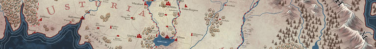
worked on this some more this morning. I'm pretty sure I'm going to go with the trees on the right hand side. I think they give more flexablity, where I can scatter a few trees here and there, to help balance out ares. I'm also probably going to go with buildings for marker, over symbols. I darkened the oceans and seas. Not 100% sold on that.
I also figured I'd work out the text now, so that as I move forward, everything fits together.
Now that I look at it, I'm probably going to redraw the lines around the cost to be more natural looking. They are starting to look to stiff.
as always, feedback is welcomed.

Last edited by TimPaul; 11-07-2013 at 12:36 PM.

I agree with you about keeping the trees on the right. The good effet you have is puting some trees between the mountains, so it looks very good.
Nice work !
Yup those trees looks ok with the mountains (though I'd scale down a bit) and the coastlines definitely need some refine here.
Just "ok"? Kidding.Originally Posted by - Max -

They will be more than ok when they'll be scaled down

I have to agree...again
I'm trapped in Darkness,
Still I reach out for the Stars
As for forests, I'd pick the one on the right since it matches the isometric angle of the map better in my opinion. Actually, I think in general it actually fits the style as a whole better. That said, the individual trees could be a tad smaller and slightly less regular.
------------------------------------------------------------------------------------------------------
Finished Maps: Skenth - Prints Available!
Works in Progress: Arinthia - region of Skenth
Need something commissioned? Send me a message!
Thanks everyone. Yes Viking, that was my thought too, the trees on the right go better with the isometric style. As for slightly smaller, exploring that. I haven't had a chance to return to this map, have a couple of jobs to work on, and last week, I had parites and industry functions to go, and then went upstate (Catskills area of New York) till late Monday with friends for a long weekend. I did do some fun character designs and sketching while up there.
So currently working on two paying jobs. Hopefully I will be able to get back to this next week or this weekend. Meanwhile here's a drawing I did this past weekend.
Thanks for all the feedback.
Good stuff.
I agree, the forest on the right hand side fit the style better, though I also really like the other one. Maybe you should add a little shadow underneath the individual trees to give them a "3d"-like feel. I think that would fit even better with those mountains.

 Reply With Quote