


 Reply With Quote
not bad, maybe add a bit of noise in the blur
something like:
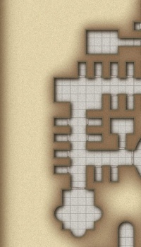

I can't decide on the colour. What do you think?

My sites: http://www.facebook.com --- http://www.stormring.com --- http://www.fantasymaps.net --- http://www.megatongames.com --- http://www.darktowershop.com
My finished maps: here
not bad, maybe add a bit of noise in the blur
something like:
Last edited by johnvanvliet; 06-10-2015 at 08:47 PM.
--- 90 seconds to Midnight ---
--------
--- Penguin power!!! ---
So you like the brown.. but the "noise" from the grey one?
My sites: http://www.facebook.com --- http://www.stormring.com --- http://www.fantasymaps.net --- http://www.megatongames.com --- http://www.darktowershop.com
My finished maps: here
Maybe the "can't decide" colour (adjusted the grey a bit to brown)?

Last edited by Carnifex; 06-10-2015 at 06:47 PM.
My sites: http://www.facebook.com --- http://www.stormring.com --- http://www.fantasymaps.net --- http://www.megatongames.com --- http://www.darktowershop.com
My finished maps: here
Grrrr....

My sites: http://www.facebook.com --- http://www.stormring.com --- http://www.fantasymaps.net --- http://www.megatongames.com --- http://www.darktowershop.com
My finished maps: here
drop the blue by a few points
-2 or -4
--- 90 seconds to Midnight ---
--------
--- Penguin power!!! ---
These maps are made in Adobe Illustrator
My sites: http://www.facebook.com --- http://www.stormring.com --- http://www.fantasymaps.net --- http://www.megatongames.com --- http://www.darktowershop.com
My finished maps: here


I prefer the gray tones over the brown
Sent from my iPad using Tapatalk
I think it depends on the mood you want to convey. If this is a home of one of the good guys, use the soft warm brown. If it's a bad guy, use the cold grey.


I tend to lean towards the Brown...I like Maps on Parchment
The Wayward Traveler
Guildmaster Galveston Island Adventurer's Guild
http://jpstodwftexas.deviantart.com
http://www.drivethrurpg.com/browse/p...?term=John+Pau
[url]http://www.patreon.com/TheWaywardTraveler[url]
 Posting Permissions
