yes, prefer the second. Its more lively with brighter stronger colors. Its a very nice bit of art.

yes, prefer the second. Its more lively with brighter stronger colors. Its a very nice bit of art.


I love your style.
In fact I'm a bit more of a fan of these types of maps then that of the more "artsy" ones.
I'd love to learn how to make similar maps.
FEAR NO EVIL
Actually, I think these maps are quite artsy. Why do I say this? Well, TheRedEpic's maps are awesome and very much like the style I would like to develop for myself. I'm still struggling with the whole "it looks like it was painted" aspect. So, knowing what I have to do to get maps that look half as good, I'd imagine that a large amount of time and effort has gone into developing the style as it stands now.Originally Posted by sivilark

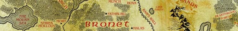
I agree with everyone's love of the color scheme. A good color scheme makes or breaks a map.
As for the stylized parchment edges, I think they work quite well. If the map were going to be on a standalone piece of paper the edges wouldn't be so desireable. Usually though, maps like this tend to be used on pages with other stuff (like in published adventures and some video games). In those cases, stylized edges can really help to make the art pop. At least, that's my opinion.
Terrific! I love the random scrawling and graffiti. Thanks for the inspiration - I am definitely going to incorporate some of this style in future player hand out maps.


Thanks everyone for the comments on my work, will be posting another map soon, depending on my workload, keep the comments coming
~jared
www.jaredblando.com
Freelance Cartographer/Conceptual Artist
:My Patreon Account:
https://www.patreon.com/JaredBlando
:My First Book: How to Draw Fantasy Art and RPG Maps: Step by Step Cartography for Gamers and Fans
:My Second Book: Fantasy Mapmaker: How to Draw RPG Cities for Gamers and Fans

I think the edges work great if the look and feel as a whole is something you would want for lets say a very old map found in a treasure box. The burnt edges and blood splatter work great.
If you are looking for a map that simply communicates the context within the map then yes the edges would be a little distracting but this type of map is perfect for a rpg game like NwN2.
Manwae
www.hiddentales.com
 Posting Permissions

 Reply With Quote