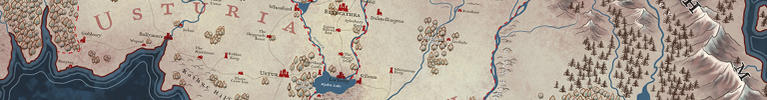
The graticule is really screwy. You seem to have mistaken the Tropic of Cancer for the equator and the spacing of the parallels is haphazard. You seem to be aiming for a Mercator projection, particularly given you've included rhumb lines and compass roses. Any cylindrical map projection is going to have the graticule mirrored about the equator but whether that really is the line you labelled "Equator" or one of the others, there's no mirroring. The specific spacing depends on the projection and how you divide up the quarter turn of angle between the equator and the poles. This has nothing to do with accuracy of surveying or changing the actual shape of the landforms: a planet is still a planet, and math is still math. This just looks wrong. Choosing to seemingly cover the entire planet and then cut off 5-10 degrees on each side also seems like a really, really strange decision that looks wrong. The alternating black and white border should also be lined up with the graticule. The reason for having such borders is to provide additional resolution without cluttering the map.
If the world in the map is genuinely different in how the land is arranged then the following doesn't apply.
It's also worth noting that the mistakes in surveying given the level of sophistication you seem to be after tend to be much more pronounced east-west than north-south. Latitude can be measured fairly easily while longitude is hard to measure accurately. If you compare a real map of the era you seem to be mimicing like this one
https://upload.wikimedia.org/wikiped...gondy-1784.jpg to a modern map in Normal Mercator projection like this one
https://upload.wikimedia.org/wikiped...jection_SW.jpg You'll see that the latitudes of features are quite accurate while most of the large errors are in terms of longitude. For instance, the tropic of cancer touches the south end of the Baja Peninsula, just misses the north end of Cuba, passes a little to the north of the easternmost point of Arabia, approximately 'cuts off' India between the northern extents of the Arabian Sea and Bay of Bengal, then cuts through Taiwan (Formosa). The width of the Bering Strait is also a bit over the top. Baffin Bay is out by a factor of 2-3 in the real 18th century map and Bering Strait by maybe as much as 5, but you have the Bering Strait out by something more like a factor of 20. It makes for nicer composition, but being inaccurate for the sake of composition is not good cartography.
The wildly different typefaces and overly ornate faces being used at to small a size for their detail are also problematic. Your labels feel disjointed as a result. Mismatching horizontal and curved labels for the same class of feature arbitrarily also hurts the cohesiveness of the map. Eduard Imhof's
Positioning Names on Maps is an awesome resource on labelling.


 Reply With Quote
Originally Posted by Hai-Etlik


 It's excellently done. My digital process is very similar, it sounds like, although I don't have a Cintiq or use Illustrator often.
 ? are part of the public domain, and you don't violate any copyright pulling from them. I suggest creating your own library and resources. I don't copy the images, I just draw my own version of sea monsters I commonly see in actual maps. because those guys ripped each other off ALL the time.


