Reply With Quote
Another great map and to see how simple it is tells a lot about your craftmanship. I especially like how clear and fair you made it. The difference between land and see is subtle but very well thought !

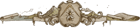
Here's a fun map I did recently for author Clifton Moberg for his new book, Pontius Pilate - Against The Truth.
It's always fun to map the Mediterranean, but this one was even more so.
I enjoy working in this style. It's just a pleasure to create those lines.
There will be a website for it, but it was not active at the time of posting, though I did wait a while to see if it would be.
I'll update the info when it is active.
The map was to orient readers to the region in which the story plays out.
I hope you enjoy it. I'm about to be swamped with work, so I may be sporadic in posting for a bit.
Hope everyone is doing well and enjoying the weather, which for me is beginning to cool and be perfect for walking and hiking.
Cheers, J

Artstation - | - Buy Me a Kofi
Another great map and to see how simple it is tells a lot about your craftmanship. I especially like how clear and fair you made it. The difference between land and see is subtle but very well thought !
NiceThis is a very pleasant map to enjoy as a viewer, too!
Thanks ThomasOriginally Posted by ThomasR

Yeah, simpler design can be the more challenging at times.
This one was designed to be very limited in color use.
Those can be quite fun to work on.
Thanks Chashio
I hope they are all pleasant for the viewer ;P but I get your meaning. ;D
Artstation - | - Buy Me a Kofi
super sweet J! A real place too.
When its over and you look in the mirror, did you do the best that you were capable of? If so, the score does not matter. But if you find that you did your best you were capable of, you will find it to your liking. -John Wooden
* Rivengard * My Finished Maps * My Challenge Maps * My deviantArt


One of my faves from you in a while. I think this style works wonderfully with such a minimal color palette. Nice one!
Try not to drown in work
Thanks Jax
Yeah, I don't get as many real world comms, but they can be a pleasure when I do.
But, but, it's so bright.Thanks Kell
Definitely. It would lose a lot with more color.
Artstation - | - Buy Me a Kofi
A very pleasant one, amazing for a novel. I do enjoy a lot the different reading levels : amazingly drawn, of course, but also so well thought
As always, superb craftsman-ship. And i agree with the others, simple in style but very expressive none the less! I especially love the coins. So much flair and flavor via these simple props, kudos!
I'm trapped in Darkness,
Still I reach out for the Stars
You always do such creative and superb layout/designs! And I love those coins
 Posting Permissions