Reply With Quote
Mountains are good, good job

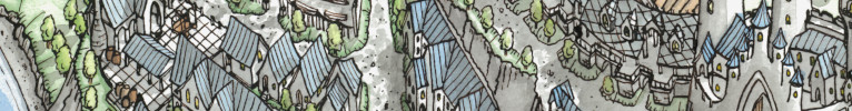
Mapa General de Tierra Azul:
I was going for a historic 1830's style map to press my abilities and try different ways to illustrate the land types. (Using this old map of Martinique as reference: https://www.mapsland.com/maps/north-...1831-small.jpg). I find mountains to be especially hard to draw from overhead because, if your not careful, you will end up with a ton of squiggly lines running in all directions. So usually I choose 45-degree angle maps.
All, except two, of the nomenclature is in Spanish because the island set in the Pacific off the coast of South America.
What do you think?
Visit my business site: The Elderly Cartographer
For commissions: Fiverr
Follow me on Twitter, Instagram, Pinterest, and DeviantArt
Mountains are good, good job
Very nice. I do really like the top-down style for drawing mountains, I used it on some of my earlier maps and I'll have to revisit it at some point. The shading on your mountains is looking great which really sells the top-down effect.
View my map and asset packs on CartographyAssets or DrivethruRPG. Support my work on Patreon. Take a look at my work on my Website or Instagram.
Thank you.Originally Posted by Simkin

Thanks. This style of mountains is definitely harder than 45-degree (e.g. Tolkien style). I leaned heavily on my reference map.
Visit my business site: The Elderly Cartographer
For commissions: Fiverr
Follow me on Twitter, Instagram, Pinterest, and DeviantArt


Love the texture in this piece. Great job!
Thank you.
Visit my business site: The Elderly Cartographer
For commissions: Fiverr
Follow me on Twitter, Instagram, Pinterest, and DeviantArt
Nothing wrong with those mountains. I would work on font consistancy and maybe leave more room around the object. Good work.
Thanks. I will keep your suggestion in mind. Typography is a pain in the backside for me. Lol.
Visit my business site: The Elderly Cartographer
For commissions: Fiverr
Follow me on Twitter, Instagram, Pinterest, and DeviantArt
 Posting Permissions