Page 1 of 2 12 LastLast
Results 1 to 10 of 15

Thread: Pilgrims Progress Map "Rough"

  1. #1
    Guild Journeyer Facebook Connected rpgmapmaker's Avatar
    Join Date
    May 2008
    Posts
    206

    Wip Pilgrims Progress Map "Rough"

    When I found this site the other day I got excited by the wonderful maps being made here and so I began making maps.

    I was commissioned by a friend to make a map for the dream world created by John Bunyan in his novel "Pilgrims Progress" back in 1678.

    Like most fantasy novels some of the printings included maps… but none of them are very good (IMO).

    But when I was first asked to make this map I had no idea where to start… and I am still very new to this type of graphic work so… anyway here is the WIP.

    pilpro_map1a.jpg

    I really like the look of some of the rock walls but I think that look, for rock should be for a smaller scale map... must be a rookie mistake... this is just the first draft so after I hear some feedback I will take another stab at it.


    -Chris

  2. #2

    Post

    Very nice!

    As for the rock walls, I guess it depends on what scale you're trying for. Since the journey is metaphorical, the scale need not be too realistic. But if you're trying for pure realism, then it might be good to ask for a scale.

    I spotted a couple small things:
    • Should "Wast Land" be "Waste Land"?
    • Does the path go under the Sloth of Despond? It might be good to show caves where the path goes into and comes out of the ground, if indeed that is what it's doing.

    I like the overall aesthetic. The palette brings to mind both 17th century England and the Biblical holy land.

  3. #3

    Post

    What software are you using?

    I like the notion of mapping Pilgrim's Progress. I've seen a few maps, but most of them were story maps more than geographical, like this one:
    http://gracebiblechurchofconway.com/...msProgress.JPG

    You've got a pretty good start. There is a disparity between some elements which are blurry and others that are crisp. Also, you could probably refine the colors a bit. The green highlights in your forests drifts toward neon, and the flat areas are very red. I don't necessarily mind a vibrant palette, but this color combination is just a little shy of garish, in my opinion.
    Bryan Ray, visual effects artist
    http://www.bryanray.name

  4. #4
    Guild Journeyer Facebook Connected rpgmapmaker's Avatar
    Join Date
    May 2008
    Posts
    206

    Post

    -Jiawen

    Wast should be Waste… oops! And there is no path through the sloth because it is more like a bog or swamp with only one very small stone step path through it (not shown) because the character in the story dose not use it. I think I will show it in the finished map though.

    As to scale… there is none given in the book but given the amount of days traveled on foot I am looking at about 300-400 miles of walked “path”. So I am estimating about 200 miles across for the map I have made… “ish”. Still working on this issue.

    Thanks for the Biblical holy land comment made my day when I read it.

    -Midgardsormr

    I used Adobe Photoshop 7 for everything in this map… I also have a small WACOM drawing tablet.

    I agree that there is a disparity between blurry and crisp that I will work on in the next version. This was the first map I made in Photoshop but now that I am registered here I have been learning a lot!

    I was going for the 17th century England “color look” found in old (garish) Catholic paintings… but I agree it needs lots of tweaking.

    ---------
    The overall goal of this map is to bring the story out of the original “dream world” and place it in a “real fantasy” world.

    Hehehe… real fantasy.

    -Chris

  5. #5

    Post

    You're going the right direction, then, but that green isn't quite right.

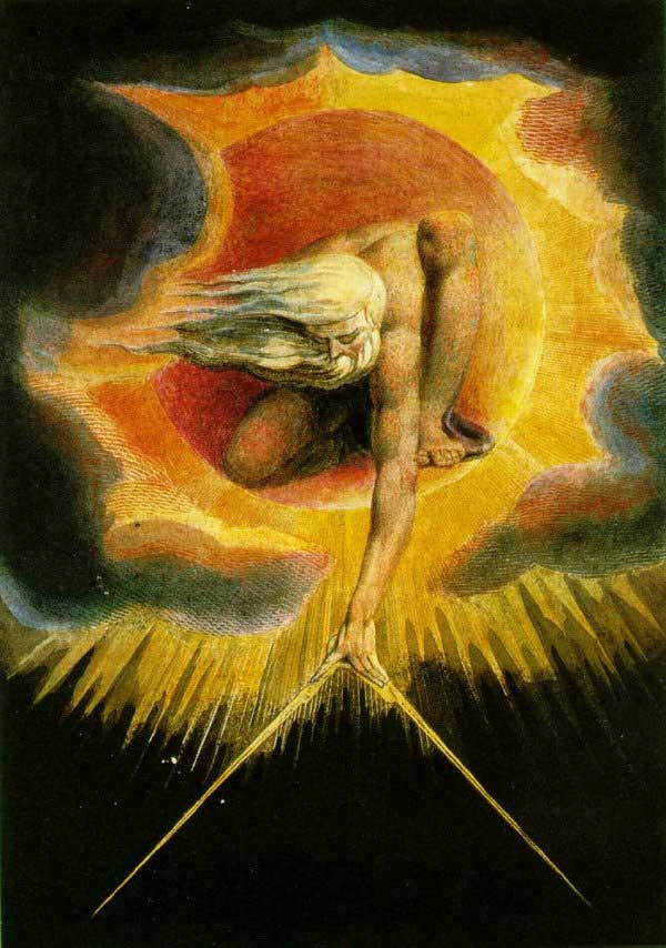
    I recommend spending some time looking at the paintings of William Blake. They're vibrant, but the colors work together powerfully.

    Bryan Ray, visual effects artist
    http://www.bryanray.name

  6. #6

  7. #7

    Post

    Looks very nice indeed.

    That it's a dream world also excuses the slightly odd path the river is taking...
    Two in harmony surpass one in perfection

  8. #8
    Guild Journeyer Facebook Connected rpgmapmaker's Avatar
    Join Date
    May 2008
    Posts
    206

    Map Test #2

    Hi all, I am trying a different style of map to see if I want to use it for the Pilgrims Progress Map. These test maps have nothing to do with the actual geography of Pilgrims' world however I am looking for feedback on whether this type of map gives more of a real world feel. The idea is that this “dream world” could be in more of a “realistic” fantasy adventure setting.

    So the key to this map is that it is not meant to depict a dream world but instead a real place that you could go for a walk...

    I love the look and feel of "classic" fantasy style maps and will be doing up a map of Pilgrims' world in this style before long. Right now I am just getting use to drawing this sort of thing.

    So here are some things I am looking for feedback on...

    1. Look and feel of the test map elements. (how did I do)
    2. How would you shake the "dream world" aspect of the story from them mind of the person looking at the map without making a modern looking atlas type map that is too realistic.
    3. Should this style have color?
    4. Suggestions on adding a border... (style etc.)

    Also, I know not everyone knows the story in detail but the locations are laid out in an almost straight line and I would like to have it “look” more like the first map I posted as far as the locations... so one big problem is the "river of life" I don't think it should be fed by smaller rivers and I would like it to run across the entire map. How can I make that work? And not look funny...?

    Please keep in mind that I am new to map making but not to criticism (I don't get my feelings hurt). This map was drawn by hand with pen and paper… there was no pre-thought as to the layout of the elements. Again this was more of a test of the elements and how they look together.

    Sorry to ramble on so… I am such a "newbe"
    Any comments and suggestions are gladly welcomed… and thanks in advance.

    -Chris

    hand_draw0001b.jpghand_draw0001a.jpg
    @BHfuturist Check out my Video Tutorials & Vault of Free Map Elements
    Unless otherwise stated in the post, all of my artwork is released into the Public Domain.

  9. #9

    Default

    Hi Chris, I think the map looks fine, the style and elements are consistent. One thing I would suggest is that you use a layer mask in the mapping process so that the route taken by Christian is highlighted on the map and the rest of the map occluded. This could be by having the route in colour and the remainder of the map in black and white or sepia (effectively a combination of the two styles you have above). That will bring out the linear aspect of the journey against a normal map.

    I read Pilgrim's Progress when I was 16 as part of my school coursework (over 25 years ago, so my memory is a bit fuzzy!), but I seem to remember locations mentioned which Christian did not actually visit (could be wrong) - these could provide fodder for filling ou that part of the map which is not highlighted.

    With the river of life, if your map shows only part of a much larger landmass, there is no reason why it should look odd flowing across the map.

    Just a few thoughts.

  10. #10

    Post

    Even in a larger area, the river doesn't necessarily have to be a problem. Consider the Nile--it's relatively straight as it flows across the desert, and has very few tributaries.

    I like your hand-drawn style; it's quite elegant. I am torn between the two versions. I like it both ways, so perhaps Rob's idea is worth investigating.

    For the border, I'd be inclined to look for a simple geometric pattern: something to make it look framed.
    Bryan Ray, visual effects artist
    http://www.bryanray.name

Page 1 of 2 12 LastLast

Posting Permissions

  • You may not post new threads
  • You may not post replies
  • You may not post attachments
  • You may not edit your posts
  •