Results 1 to 10 of 15

Thread: Pilgrims Progress Map "Rough"

Hybrid View

Previous Post Previous Post   Next Post Next Post
  1. #1

    Post

    What software are you using?

    I like the notion of mapping Pilgrim's Progress. I've seen a few maps, but most of them were story maps more than geographical, like this one:
    http://gracebiblechurchofconway.com/...msProgress.JPG

    You've got a pretty good start. There is a disparity between some elements which are blurry and others that are crisp. Also, you could probably refine the colors a bit. The green highlights in your forests drifts toward neon, and the flat areas are very red. I don't necessarily mind a vibrant palette, but this color combination is just a little shy of garish, in my opinion.
    Bryan Ray, visual effects artist
    http://www.bryanray.name

  2. #2
    Guild Journeyer Facebook Connected rpgmapmaker's Avatar
    Join Date
    May 2008
    Posts
    206

    Post

    -Jiawen

    Wast should be Waste… oops! And there is no path through the sloth because it is more like a bog or swamp with only one very small stone step path through it (not shown) because the character in the story dose not use it. I think I will show it in the finished map though.

    As to scale… there is none given in the book but given the amount of days traveled on foot I am looking at about 300-400 miles of walked “path”. So I am estimating about 200 miles across for the map I have made… “ish”. Still working on this issue.

    Thanks for the Biblical holy land comment made my day when I read it.

    -Midgardsormr

    I used Adobe Photoshop 7 for everything in this map… I also have a small WACOM drawing tablet.

    I agree that there is a disparity between blurry and crisp that I will work on in the next version. This was the first map I made in Photoshop but now that I am registered here I have been learning a lot!

    I was going for the 17th century England “color look” found in old (garish) Catholic paintings… but I agree it needs lots of tweaking.

    ---------
    The overall goal of this map is to bring the story out of the original “dream world” and place it in a “real fantasy” world.

    Hehehe… real fantasy.

    -Chris

  3. #3

    Post

    You're going the right direction, then, but that green isn't quite right.

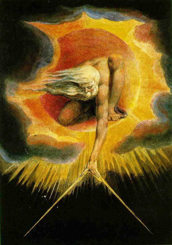
    I recommend spending some time looking at the paintings of William Blake. They're vibrant, but the colors work together powerfully.

    Bryan Ray, visual effects artist
    http://www.bryanray.name

  4. #4

  5. #5

    Post

    Looks very nice indeed.

    That it's a dream world also excuses the slightly odd path the river is taking...
    Two in harmony surpass one in perfection

Posting Permissions

  • You may not post new threads
  • You may not post replies
  • You may not post attachments
  • You may not edit your posts
  •